Preview image. Unlock full-res
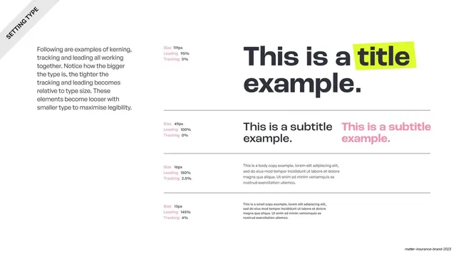
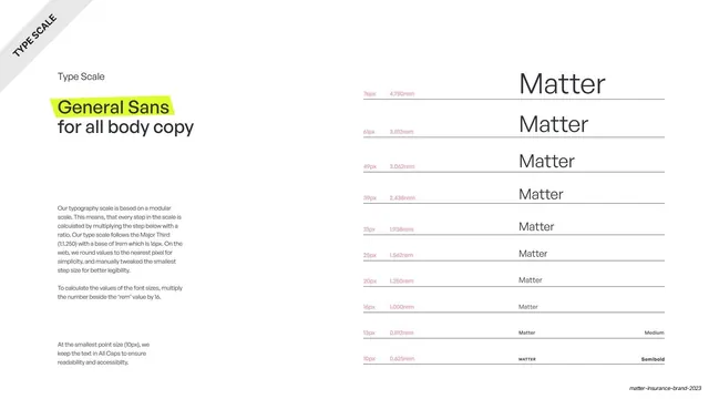
A type specimen showing title, subtitle, body and small copy sizes side by side with their kerning, tracking and leading values, including a lime-highlighted word.
Summary
A type-setting reference page that stacks four scales from a 119px title down to 13px small copy, each annotated with its kerning, tracking and leading, to show how larger type tightens.
Visual description
White slide with a small rotated black "SETTING TYPE" banner in the top-left corner. A left column of dark body copy explains that bigger type takes tighter tracking and leading. The right two-thirds is a stacked specimen separated by thin hairline rules. Top row: an oversized two-line title "This is a title example." in near-black sans, with the word "title" sitting inside a tilted lime-green highlight box. Below: a 49px subtitle shown twice, once in dark grey and once in soft pink. Then 16px body copy and 13px small copy blocks in greyscale. A narrow far-left column lists "Size / Leading / Tracking" values (the labels in pink) against each scale.
Key takeaway
Pairing every type size in the scale with its exact kerning, tracking and leading numbers, so the rule (bigger type, tighter spacing) is shown not just stated. The single tilted lime highlight on one word demonstrates the brand's accent device inside an otherwise plain specimen.
Reuse notes
A clean template for the type-scale page of any brand or design-system deck. The dark/grey/pink subtitle pairing shows color variants in one glance. Works on light backgrounds; depends on a real type hierarchy with sensible step sizes.
From this deck: Matter type-setting legibility examples
View deck










More like this









Keep what you find
A free account saves references to boards and can send you a weekly email of picks based on what you save.
To see every result, go Pro.