Preview image. Unlock full-res
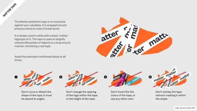
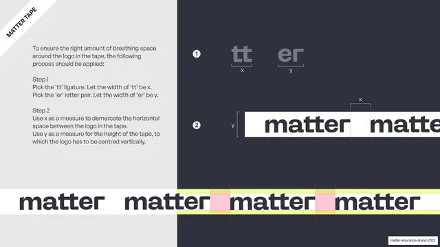
The matter protection tape explained, a large orange tape-wrapped silhouette plus four numbered red-cross dos-and-donts on distorting, respacing, recoloring or unmasked tape.
Summary
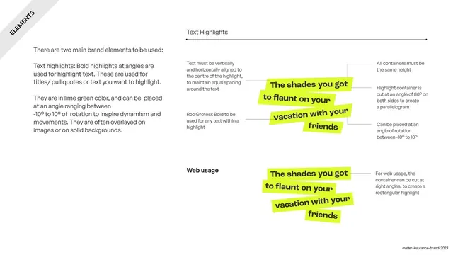
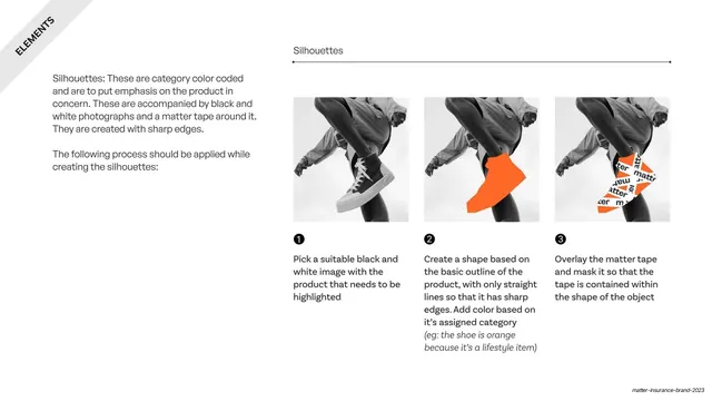
The defining brand-element page: it introduces the "matter" protection tape, shows a correct orange sneaker silhouette wrapped in it, then forbids four misuses in a numbered row.
Visual description
Light grey slide with a rotated "MATTER TAPE" corner banner. A left text column explains the white tape with a black "matter" logotype is wrapped around brightly colored object silhouettes like real tape. To the right, a large orange sneaker silhouette is crisscrossed with white "matter" tape strips at angles. Across the bottom, four numbered examples of an orange shoe each show a wrong version struck through with a thin red diagonal line: don't curve or distort the tape, don't change the logo spacing or tape height, don't invert or recolor it, and don't overlay tape without masking it to the shape. Each is captioned beneath.
Key takeaway
Building a whole identity around one ownable graphic device (angled "matter" tape over a flat-color silhouette) and locking it down with a clear correct example plus four red-cross donts. The orange silhouette under white tape is instantly recognizable.
Reuse notes
The gold-standard layout for codifying a signature brand element: one big correct usage, a numbered do-not row, short captions. Reusable for any motif (patterns, badges, mascots). The tape concept itself is bespoke to an insurance/protection story; adapt the structure, not the motif.
From this deck: Matter tape usage and misuse
View deck

















More like this









Keep what you find
A free account saves references to boards and can send you a weekly email of picks based on what you save.
To see every result, go Pro.