Preview image. Unlock full-res
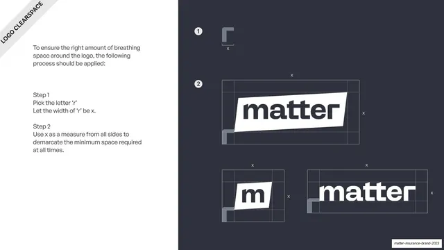
Dark clearspace page deriving the safe margin from the width of the letter r, shown around all three logo variants.
Summary
The clearspace page: a two-step method defines the exclusion margin "x" from the width of the letter "r", then applies it as a dashed boundary around each logo variant on a dark field.
Visual description
A slate-grey (#2F323A) full-bleed slide split left/right, with a rotated "LOGO CLEARSPACE" ribbon in the top-left corner. The left is a text column: an intro plus "Step 1 - pick the letter r, let its width be x" and "Step 2 - use x as the margin on all sides". The right shows the construction: a numbered "1" beside an enlarged "r" glyph with an "x" measure bracket, then a numbered "2" with the primary "matter" lockup boxed by a dashed clearspace rectangle marked "x" on every side, and below it the secondary "m" mark and the type wordmark each given the same dashed margin. Thin white dashed lines and small "x" labels throughout.
Key takeaway
Deriving the clearspace unit from a letterform inside the logo itself (the "r" width), so the exclusion zone scales with the mark automatically. Numbering the steps and showing the rule applied to all three variants on one page makes it unambiguous.
Reuse notes
A textbook clearspace template, reusable for any identity. Tying the margin to a glyph width rather than a fixed measurement is the transferable idea. Keep the same dark technical treatment as the construction page for a consistent "specs" run.
From this deck: Logo clearspace construction
View deck
























More like this








Keep what you find
A free account saves references to boards and can send you a weekly email of picks based on what you save.
To see every result, go Pro.