Preview image. Unlock full-res
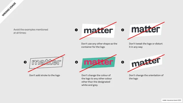
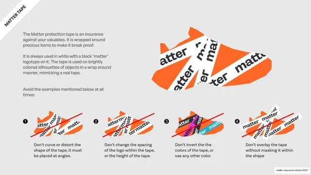
Wrong-usage page with five numbered logo-misuse examples each crossed out by a red diagonal line.
Summary
The misuse page: five numbered examples of incorrect logo treatment, each struck through with a bold red diagonal line on a light grey field.
Visual description
A light grey (#E6E6E6) full-bleed slide with a rotated "WRONG USAGE" ribbon in the top-left corner and an intro line ("Avoid the examples mentioned at all times"). Five numbered (1-5) logo examples are arranged in a loose grid, each crossed out by a red diagonal stroke: 1, the wordmark in a wrong (non-skewed) container; 2, a distorted/stretched lockup; 3, an outline-only logo with a thin stroke; 4, the wordmark in pink on a teal box (wrong colors); 5, the lockup rotated to a steep angle. Each carries a short "Don't..." caption in dark grey below it.
Key takeaway
The blunt red diagonal strike over each violation plus a one-line "Don't" caption, the universally legible "no" pattern. Numbering the donts ties them back to the dos page and keeps the grid scannable.
Reuse notes
The standard misuse-grid template, reusable in any guideline. Mirror the count and layout of your dos page so the two read as a pair. Keep the red strike consistent and the captions to a single sentence each.
From this deck: Logo misuse grid with red strike-throughs
View deck











More like this








Keep what you find
A free account saves references to boards and can send you a weekly email of picks based on what you save.
To see every result, go Pro.