Preview image. Unlock full-res
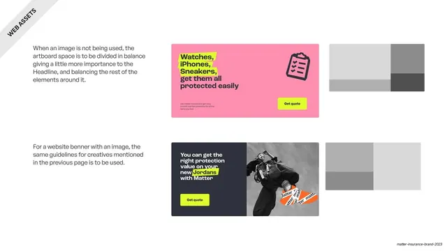
Web banner layout rules with two finished examples (a pink icon banner and a navy image banner with Get quote buttons) each paired with a grey proportion map.
Summary
Web banner layout rules: when there is no photo, balance the artboard around a slightly dominant headline; when there is, reuse the poster rules. Two finished banners each sit beside a grey proportion map.
Visual description
A near-white slide with a rotated "WEB ASSETS" corner banner. Two stacked rows, each a finished banner plus a grey block proportion map. Top row: a hot-pink horizontal banner with a stacked lime-highlighted headline ("Watches, iPhones, Sneakers, get them all protected easily"), a grey clipboard icon and a lime "Get quote" button, mapped to an asymmetric grey grid. Bottom row: a navy banner with a white headline ("You can get the right protection value on your new Jordans with Matter"), a lime "Get quote" button and a black-and-white tape-wrapped photo on the right, mapped to its own grey grid. Left captions explain the no-image and with-image cases.
Key takeaway
Documenting two banner cases (text-only and image) side by side, each with its own grey proportion map, and reusing the lime "Get quote" button as the fixed CTA. It shows the same layout logic flexing to content.
Reuse notes
A reusable web-banner spec page; the example-plus-greybox-map device matches the poster page so the system feels continuous. Carries the brand's pink, navy, lime and tape palette. Pair with the poster layout slide.