Preview image. Unlock full-res
Poster and banner layout rules, give 50-60% of the artboard to a tape-and-silhouette image, the rest to the headline and logo, shown with a finished example and a proportion map.
Summary
Layout rules for posters and web banners: roughly half to two-thirds of the artboard goes to a product image with color blocking and tape, the rest to a highlighted headline and logo.
Visual description
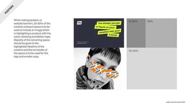
Light grey slide with a rotated "POSTERS" corner banner. The left text column states 50-60% of the artboard should hold an image highlighting a product with color blocking and matter tape, with the remainder for the headline, logo and small copy. The center shows a finished example: a top navy panel with the "m" logo, a four-line lime-highlighted headline and small copy, above a black-and-white photo of a woman with an orange tape graphic over her face. To the right, a grey block diagram maps the same proportions, labeled 10-20%, 30% and 50-60% to show how the space is divided.
Key takeaway
Pairing a real finished poster with an abstract proportion map beside it, so the spatial rule (image dominant at 50-60%, headline and logo filling the rest) is both shown and diagrammed. It makes the ratio reproducible across new layouts.
Reuse notes
A clean composition-rules page for poster or banner systems. The finished-example-plus-greybox-map pairing is widely reusable for any layout spec. Relies on the brand's tape and lime-highlight devices to carry the example.