Preview image. Unlock full-res
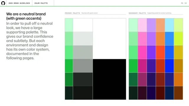
Color-palette opener stating GitHub is a neutral brand with green accents, beside large primary neutral and vivid secondary palette blocks.
Summary
The color chapter intro: a headline declaring a neutral brand with green accents, paired with two large color-block columns previewing the primary (neutral plus green) and secondary (multi-hue) palettes.
Visual description
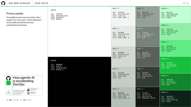
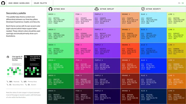
Left column holds a black two-line headline "We are a neutral brand (with green accents)" over a long gray paragraph. The right two-thirds shows two labeled palette stacks under monospace eyebrows: PRIMARY PALETTE (a column of greens, a column of grays, and a large white-to-black block) and SECONDARY PALETTE (a six-column grid running green, pink, purple, orange, blue, lime from light at top to dark at bottom). Tiles are flat solid color with thin separators. Standard header and green rule above.
Key takeaway
Opening a color section by previewing the whole system as two big swatch fields before any hex values appear, so the reader grasps the neutral-plus-accent strategy at a glance.
Reuse notes
A strong intro layout when a palette has a clear hierarchy (restrained core, expansive support). The big blocks set expectations that the following spec pages then detail.
From this deck: GitHub guidelines - neutral brand color intro
View deck





More like this

Keep what you find
A free account saves references to boards and can send you a weekly email of picks based on what you save.
To see every result, go Pro.