Preview image. Unlock full-res
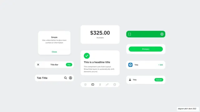
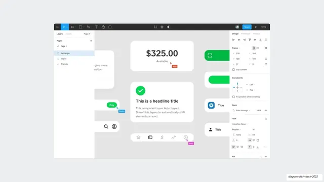
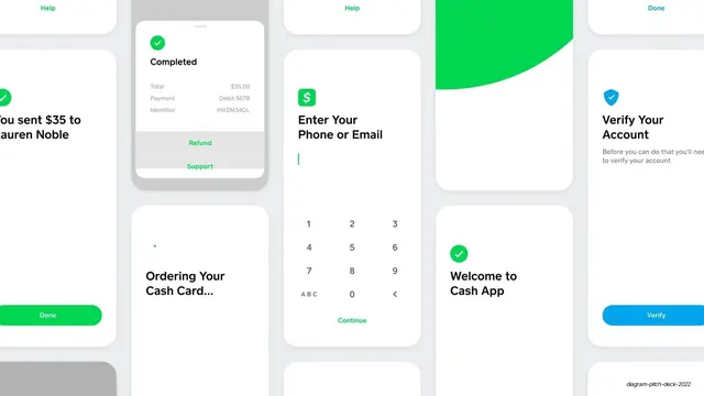
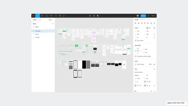
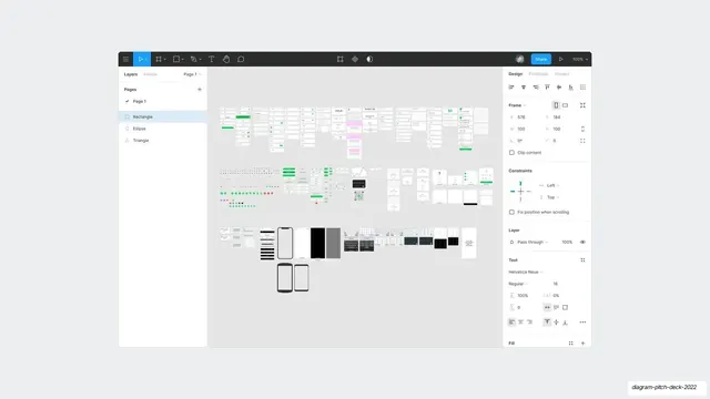
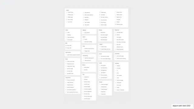
A loosely gridded set of clean white UI components, modals, title bars, a balance card, buttons, and list rows, demonstrating Auto Layout patterns.
Summary
A component-kit slide: an array of crisp white UI pieces, a modal, title and tab bars, a large balance card, a success card, and a stack of buttons and list rows, arranged in loose columns.
Visual description
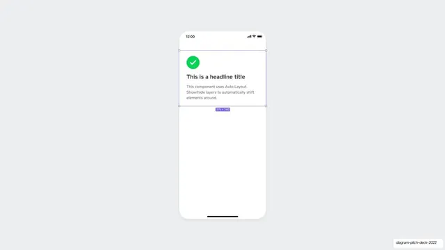
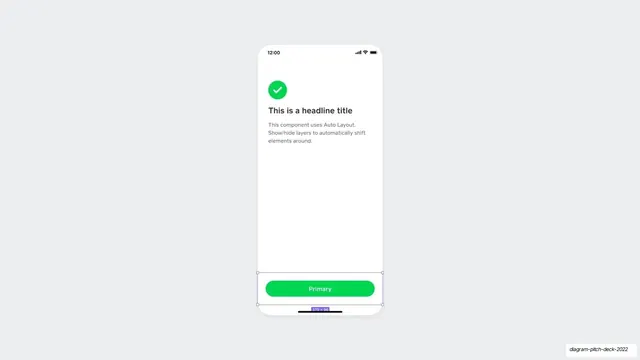
Flat off-white background with white rounded components organized into roughly three columns. Left column: a "Simple" modal with a Close action, a "Title Bar" row with a green Pay pill, and a "Tab Title" search row. Center column: a big "$325.00 Available" balance card, a success card headed "This is a headline title" with a green check, and a bottom icon nav bar. Right column: a vertical stack of buttons (a green full-width button, a green "Primary" pill, and two list rows with "+ $25" and a green "Cancel" pill). Accents are mostly Cash App green with one blue icon. The pieces are evenly spaced like a UI kit sheet.
Key takeaway
Showing the product as a tidy component sheet of finished, real-looking UI parts, which reads as "we have a mature design system" far more convincingly than a screenshot. The consistent white-card-on-neutral treatment makes a diverse kit feel unified.
Reuse notes
Ideal for a product-depth or design-system slide. Pairs naturally with a following slide that shows the same components assembled into a screen. Keep one accent color across the kit; the green here ties every disparate part together.
From this deck: Auto Layout components showcase
View deck



More like this

Keep what you find
A free account saves references to boards and can send you a weekly email of picks based on what you save.
To see every result, go Pro.