Preview image. Unlock full-res
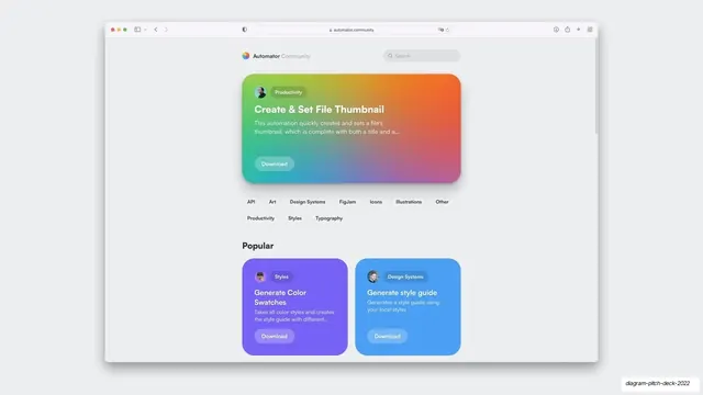
A browser mockup of the Automator Community site with a rainbow-gradient featured card, category filter chips, and a Popular section of colored cards.
Summary
A full browser mockup of the "Automator Community" web app: a large rainbow-gradient hero card featuring "Create & Set File Thumbnail", a row of category filter chips, and a "Popular" grid of purple and blue automation cards.
Visual description
A realistic Safari window (full chrome, "automator.community" in the address bar) sits on pale gray. Inside, a light page leads with a wide rounded card in a saturated green-to-orange-to-magenta gradient holding an avatar, a "Productivity" pill, the bold white title "Create & Set File Thumbnail", a description, and a translucent "Download" button. Below, a wrapped row of outline filter chips (API, Art, Design Systems, FigJam, Icons, Illustrations, Other, Productivity, Styles, Typography). Beneath a bold "Popular" header, two colored cards begin a grid: a purple "Generate Color Swatches" tile and a blue "Generate style guide" tile, each with avatar, category pill, blurb, and Download button.
Key takeaway
Showing the actual community website, browser chrome and all, grounds the marketplace claim in something that visibly exists. The single bright gradient hero card against an otherwise restrained page creates clear hierarchy and energy.
Reuse notes
Use to present a real destination (community hub, marketplace, gallery) inside a pitch. The category chips and Popular grid imply scale and curation. A gradient feature card is a reusable way to spotlight one item above a uniform grid. Needs a believable site UI to carry it.
From this deck: Automator Community website mockup
View deck





























More like this





Keep what you find
A free account saves references to boards and can send you a weekly email of picks based on what you save.
To see every result, go Pro.