Preview image. Unlock full-res
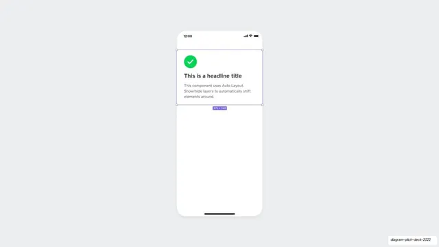
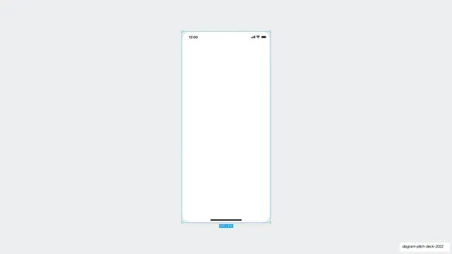
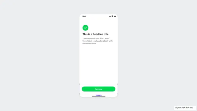
An iPhone mockup holding a single auto-layout card with a green check, a headline, and body copy, selected in Figma with a 375x240 size badge.
Summary
A tall iPhone frame on gray, containing one auto-layout success card: a green circular check, a bold "This is a headline title", and two lines of muted body copy, with Figma's selection box around it.
Visual description
A white phone screen is centered on a pale gray (#ECEDEF) field, status bar reading 12:00 with signal, wifi, and battery at top right. Near the top of the screen sits a card: a green (#00D54B) circle with a white checkmark, then a bold near-black headline "This is a headline title", then two lines of gray body text explaining that the component uses Auto Layout and shifts elements when layers are toggled. Purple-blue Figma selection handles bracket the card and a small badge reads "375 x 240". The rest of the screen is empty white.
Key takeaway
Demonstrating an auto-layout component in situ, with the Figma selection and dimension badge left visible, turns a generic success card into proof of how the design system behaves. The placeholder copy literally describing the layout behavior is a neat self-documenting touch.
Reuse notes
Good for a product slide that needs to show a single component cleanly and hint at responsive behavior. Pairs naturally with a follow-up slide that adds another element to the same card. The visible editor chrome only suits a design-tooling narrative.
From this deck: Auto-layout card phone mockup
View deck










More like this
Keep what you find
A free account saves references to boards and can send you a weekly email of picks based on what you save.
To see every result, go Pro.