
Preview image. Unlock full-res
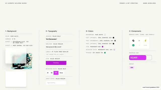
An abstract scatter of UI primitives, a black card, list rows, a green keypad block, a line chart, pills, and dots, floating across the off-white field.
Summary
An abstract composition of disconnected UI building blocks scattered across the slide: a black card, list rows with colored avatars, a green dotted grid block, a cyan line chart, and assorted pills and dots.
Visual description
Flat off-white background with UI primitives floating at varied positions and sizes, not arranged into any screen. A black credit-card-like rectangle sits upper-left of center; below and around it are white list rows with blue and pink circular avatars and colored text bars, a green rounded square filled with a dot grid, a small green pill and toggle-like shapes, a cyan wavy line chart with a dotted progress track, and a horizontal pill of mini icons. Greens, a magenta, and a cyan punctuate the otherwise neutral field. The arrangement is deliberately loose and asymmetric.
Key takeaway
Representing a design system or product as a constellation of loose, recognizable UI atoms rather than a finished screen, which communicates "components and building blocks" abstractly while staying light and on-brand. The scattered layout feels generative and modular.
Reuse notes
A good conceptual slide for design systems, component libraries, or modular-product stories. The abstraction avoids dating the slide to one specific UI. Keep the accent colors few so the scatter reads as intentional, not noisy.
From this deck: UI component grammar scatter
View deck


































More like this
Keep what you find
A free account saves references to boards and can send you a weekly email of picks based on what you save.
To see every result, go Pro.