Preview image. Unlock full-res
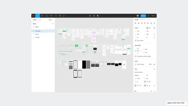
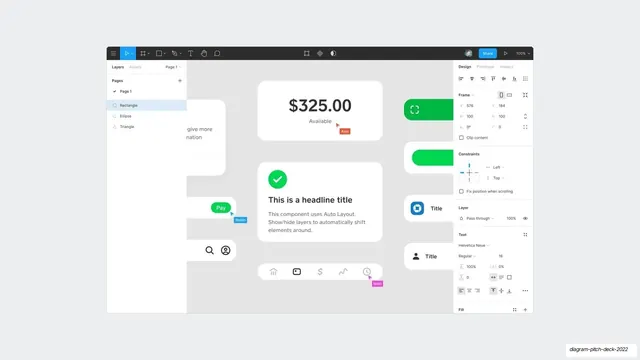
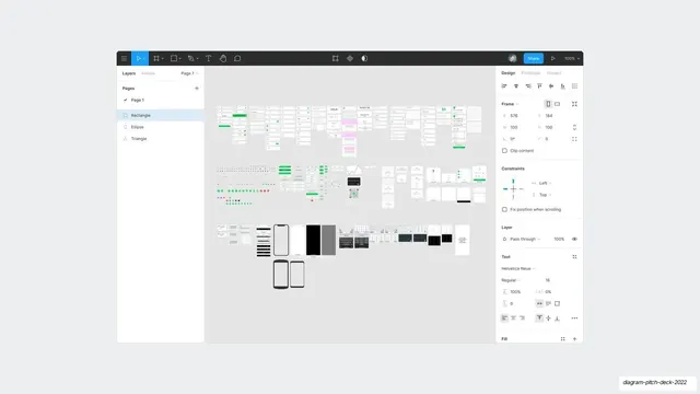
A full screenshot of the Figma editor showing the whole working file, with the layers panel, design inspector, and dozens of small artboards laid out across the canvas.
Summary
A wide screenshot of the actual Figma editor, showing the entire deck's source file: rows of tiny artboards on the canvas with the layers panel on the left and the design inspector on the right.
Visual description
The full Figma application UI fills the slide. A dark toolbar runs across the top with move, frame, shape, pen, text, hand, and comment tools, a blue Share button, and a 100% zoom control. The left panel shows Pages and a Layers list (Page 1 with Rectangle, Ellipse, Triangle entries). The right Design panel shows Frame coordinates, Constraints, Layer blend mode, and Text settings (Helvetica Neue, Regular 16). The large central canvas is packed with three loose horizontal bands of small light artboards (forms, lists, icon sets, phone screens, dark mockups), reading as the entire deck's working file seen at a distance.
Key takeaway
Dropping the real editor in, zoomed out so the whole file reads as one texture, is a confident way to show the volume of craft behind a product without narrating it. The chrome itself signals "this was all made in the tool we are pitching."
Reuse notes
A meta move that only works for a design or developer-tool pitch where showing the build environment reinforces the story. The dense artboard field is best used as a transition or a "look how much we made" beat, not a slide anyone is meant to read.
From this deck: Full Figma editor canvas screenshot
View deck




More like this




Keep what you find
A free account saves references to boards and can send you a weekly email of picks based on what you save.
To see every result, go Pro.