Preview image. Unlock full-res
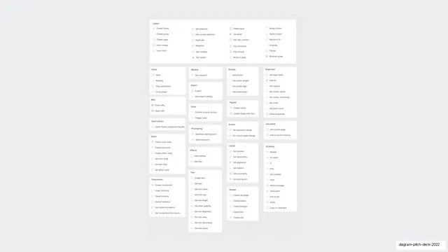
A dense multi-column catalog of every Automator action, grouped under headers like Layers, Text, Components, Layout, and Scripting.
Summary
A "look how much it does" slide: a wide grid listing the entire Automator action library as small icon-and-label rows, organized into category columns.
Visual description
On pale gray, dozens of monochrome icon-plus-text rows are tiled across roughly four columns, each cluster sitting under a small bold header: Layers (Create frame, Create group, Create page, Insert image, Insert SVG, Set selection, Delete layer, Bring to front, and more), then Other, Web, Team Library, Styles, Components, Window, Export, Undo, Prototyping, Effects, Text, Strokes, FigJam, Events, Layout, Shapes, Properties, Document, and Scripting (Repeat, For each, If, Else, Set variable, Find, Run script, Delay). Everything is tiny, gray, and evenly gridded, so the sheer count of entries is the message rather than any single item.
Key takeaway
Showing an entire capability surface as one calm, uniformly gridded list is a confident way to assert breadth, the volume does the talking. Grouping under quiet category headers keeps a huge inventory scannable instead of overwhelming.
Reuse notes
Use when the pitch needs to prove scope (a large action set, API surface, integration count, or feature library). The uniform gray icon rows read as "comprehensive and organized". Keep one accent or none, since the density is the point. Pairs well right after a single-action demo to zoom out to the whole catalog.
From this deck: Automator full action catalog grid
View deck
















































More like this


Keep what you find
A free account saves references to boards and can send you a weekly email of picks based on what you save.
To see every result, go Pro.