Preview image. Unlock full-res
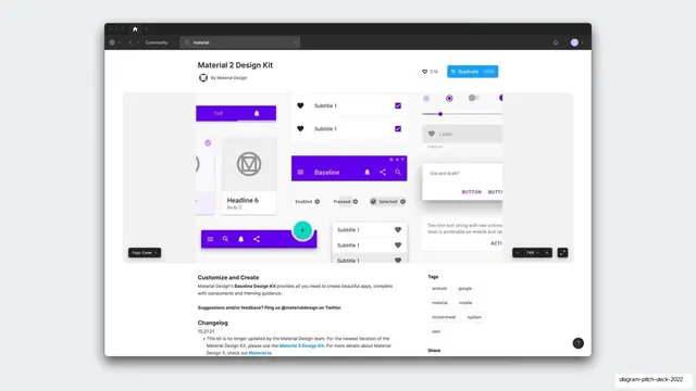
A screenshot of the Figma Community page for the Material 2 Design Kit, with its like and duplicate counts, tags, and a purple preview wall of Material components.
Summary
A browser screenshot of the Figma Community listing for the "Material 2 Design Kit" by Material Design, showing 5.1k likes, 265k duplicates, tags, and a preview wall of purple Material components.
Visual description
A light Figma Community page sits on a pale gray slide with a soft shadow. The dark app frame shows a Community breadcrumb and a "material" search field. The title "Material 2 Design Kit" sits above "By Material Design" with the round Material "M" avatar; to the right are a 5.1k like pill and a blue "Duplicate 265k" button. The wide preview band tiles Material components in the signature deep purple (#6200EE): a tab bar with a bell, a circular "M" card, headline and body cells, a baseline app bar, selectable chips, radio and slider controls, and list rows with heart icons. A "Customize and Create" section, a Tags block (android, google, material, mobile, stickersheet, system, uikit), and a Changelog sit below.
Key takeaway
A second community screenshot, paired with the previous one, builds a quick comparison of reference kits using only their real like and duplicate counts. Letting two competitor pages sit back to back lets the audience size the market themselves.
Reuse notes
Pairs directly with the preceding community slide as a two-up market or landscape view. The visible 265k duplicate count is the persuasive element, so favor kits with strong public metrics. Suits an audience fluent in the platform being shown.
From this deck: Material 2 Design Kit community screenshot
View deck

More like this

Keep what you find
A free account saves references to boards and can send you a weekly email of picks based on what you save.
To see every result, go Pro.