Preview image. Unlock full-res
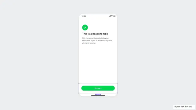
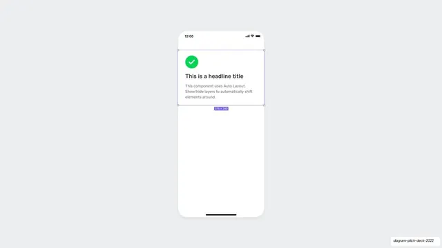
The same success-card phone mockup as before, now with a green pill Primary button pinned to the bottom and a Figma selection around it.
Summary
A tall iPhone mockup on gray showing the earlier success card at the top and a full-width green "Primary" pill button now anchored to the bottom of the screen, selected in Figma.
Visual description
A white phone screen sits centered on a pale gray (#ECEDEF) field. Near the top is the familiar card: a green (#00D54B) circle with a white check, a bold "This is a headline title", and two lines of gray Auto Layout body copy. Pinned to the bottom of the screen is a full-width rounded pill button in the same green, labeled "Primary" in white. Purple-blue Figma selection handles bracket the button area, with a small "375 x 96" size badge below it. The middle of the screen stays empty white.
Key takeaway
Building the same screen up across consecutive slides, here by adding a bottom-anchored primary action, shows auto-layout and component composition as a process rather than a finished result. The consistent green ties the check, button, and brand together.
Reuse notes
Effective as the payoff in a two- or three-slide build sequence demonstrating a component system. The bottom-pinned full-width pill is a clean reusable CTA pattern in its own right. Visible editor chrome keeps it tied to a design-tool story.
From this deck: Auto-layout card with primary button mockup
View deck


More like this
Keep what you find
A free account saves references to boards and can send you a weekly email of picks based on what you save.
To see every result, go Pro.