Preview image. Unlock full-res
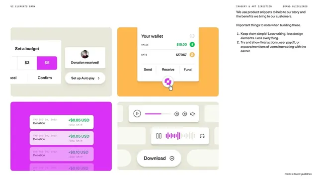
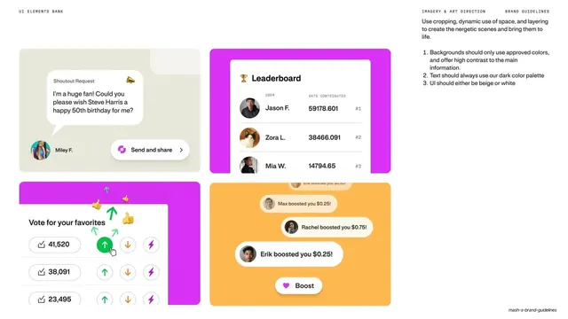
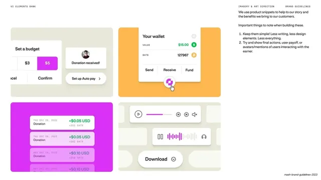
Light UI-bank page showing four product snippets on tinted cards (budget, wallet, donation feed, media player) with build notes.
Summary
A UI elements bank on cream: four floating product snippets, each set on a tinted card (beige, orange, magenta), demonstrating how real Mash interface pieces are cropped and styled for brand use.
Visual description
Cream full-bleed slide. Mono "UI ELEMENTS BANK" top left, "IMAGERY & ART DIRECTION / BRAND GUIDELINES" top right with a short intro and a numbered note ("Keep them simple", "Try and show final actions, user payoff, or avatars"). The lower area holds a 2x2 set of large rounded cards: a beige card with a "Set a budget" amount toggle ($3/$5) and a "Donation received!" avatar pill; an orange card framing a white "Your wallet" panel showing value, sats, and Send / Receive / Fund actions with a magenta cursor; a magenta card stacking green "+$0.05 USD" donation feed rows; and a beige card holding a white media player with a magenta scrubber and a Download control. Each snippet sits in soft drop shadow on its tinted ground.
Key takeaway
Presenting product UI as cropped snippets floating on brand-colored cards, so screenshots feel art-directed rather than dumped in. The rule of one payoff moment per card (a confirmation, a balance, an incoming donation) keeps each tile legible.
Reuse notes
Ideal for the application section of a product brand book, or a feature wall on a marketing site. Reuse the tinted-card-plus-snippet device to make any UI look intentional. Needs polished, real interface pieces and a small set of approved background tints.
From this deck: Mash UI elements bank wallet snippets
View deck
More like this
Keep what you find
A free account saves references to boards and can send you a weekly email of picks based on what you save.
To see every result, go Pro.