Preview image. Unlock full-res
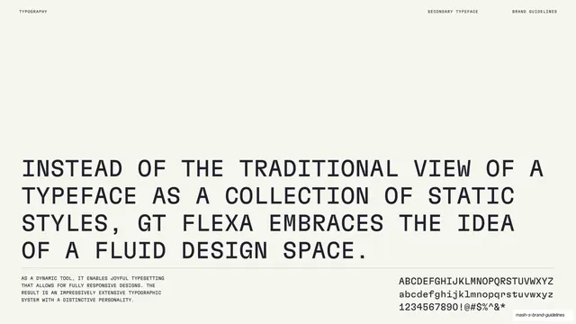
A light slide stating GT Flexa's fluid-design philosophy in a large all-caps paragraph with a footer character set.
Summary
The GT Flexa explainer: a large all-caps statement of its fluid-design-space philosophy, with a small feature note and full character set in the footer.
Visual description
Warm off-white ground. The center holds a big all-caps monospace statement: "Instead of the traditional view of a typeface as a collection of static styles, GT Flexa embraces the idea of a fluid design space." A thin rule sits below. The lower-left has a small note that, as a dynamic tool, it enables joyful, fully responsive typesetting with an extensive system and distinctive personality; the lower-right shows the upper/lowercase alphabet and numerals/symbols. Header: "TYPOGRAPHY" / "SECONDARY TYPEFACE" / "BRAND GUIDELINES".
Key takeaway
Setting the typeface's philosophy in the face itself at large size, matching the structure of the primary-type description page, so the two chapters stay parallel. Pairing the statement with a corner character set again makes the page double as a specimen.
Reuse notes
The description page for a secondary typeface, mirroring the primary's layout. Keep the statement specific to what makes the face distinctive; reuse the footer note-plus-character-set arrangement for consistency across both type chapters.
From this deck: Mash GT Flexa design philosophy
View deck

































More like this






Keep what you find
A free account saves references to boards and can send you a weekly email of picks based on what you save.
To see every result, go Pro.