Preview image. Unlock full-res
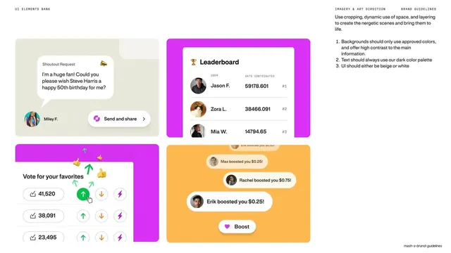
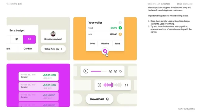
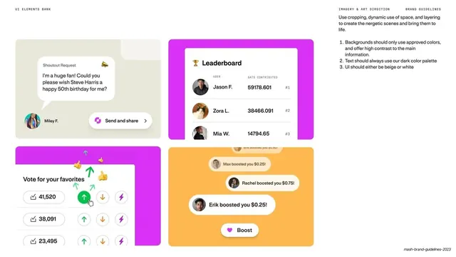
Light UI-bank page of four social product snippets (shoutout, leaderboard, voting, boosts) on tinted cards with cropping rules.
Summary
A second UI elements bank page on cream, showing four social and engagement snippets on tinted cards with notes on cropping, contrast, and which colors backgrounds and text may use.
Visual description
Cream full-bleed slide. Mono "UI ELEMENTS BANK" top left, "IMAGERY & ART DIRECTION / BRAND GUIDELINES" top right with a paragraph on cropping and layering plus a numbered rule list (backgrounds only approved colors, text always dark palette, UI beige or white). A 2x2 set of large rounded cards: a beige card with a "Shoutout Request" speech bubble and a "Send and share" pill; a magenta card framing a white "Leaderboard" panel ranking users by sats contributed with avatars; a magenta card with a "Vote for your favorites" list of up/down counters and a green active arrow; and an orange card stacking "boosted you" notification toasts with avatars and a magenta "Boost" button. Each snippet floats in soft shadow on its tint.
Key takeaway
Extending the snippet-on-tinted-card system to social and gamified UI, and pinning down the rules (approved background colors, dark text, beige-or-white UI) right next to the examples. The mix of magenta and orange grounds shows the palette flexing without breaking.
Reuse notes
Pairs with the previous UI bank slide as a two-page set covering wallet and social surfaces. Reuse for community, leaderboard, or engagement features in a product deck or site. The adjacent do-this rule list is worth copying so contributors stay on-palette.
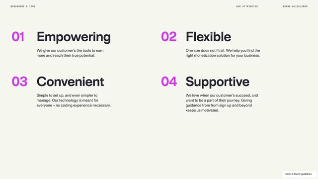
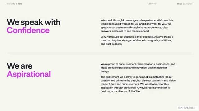
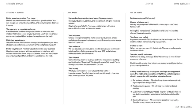
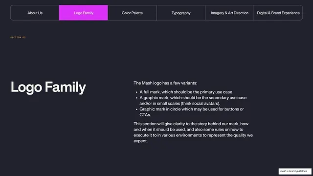
From this deck: Mash UI elements bank social snippets
View deck








More like this

Keep what you find
A free account saves references to boards and can send you a weekly email of picks based on what you save.
To see every result, go Pro.