Preview image. Unlock full-res
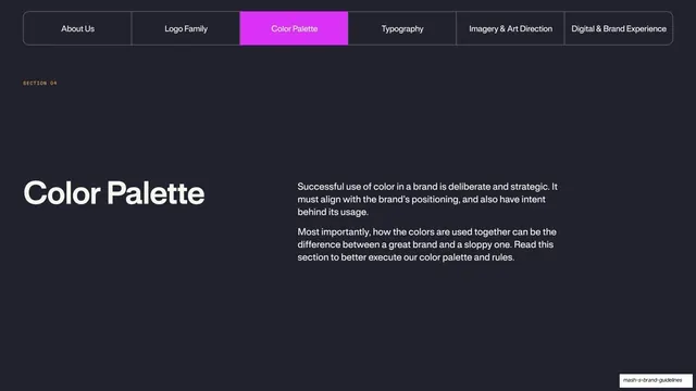
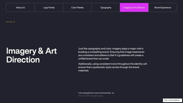
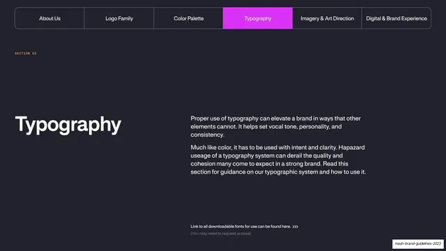
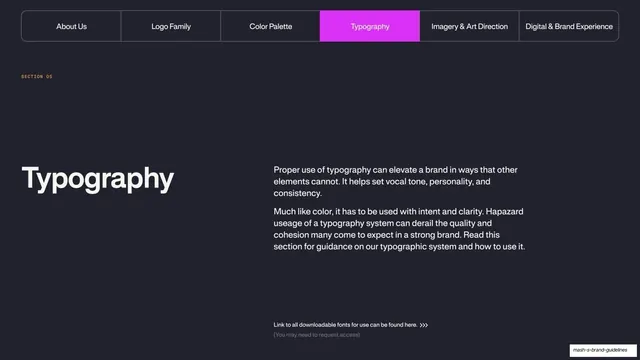
A dark Typography section opener with the tabbed nav, an oversized "Typography" title, intro copy, and a downloadable-fonts link.
Summary
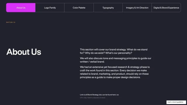
The Typography section opener, matching the Color divider: the tab bar across the top with "Typography" lit magenta, an oversized title left, intro paragraphs right, and a font-download link at the bottom.
Visual description
Near-black ground. The full-width rounded tab bar runs across the top (About Us, Logo Family, Color Palette, Typography, Imagery & Art Direction, Digital & Brand Experience) with the "Typography" tab filled bright magenta. A monospace "SECTION 05" label sits below. Lower left, an oversized white "Typography" headline; to its right, two paragraphs about typography setting vocal tone, personality, and consistency, and the risk of haphazard usage. Near the bottom, small text "Link to all downloadable fonts for use can be found here" with a chevron and a quieter "(You may need to request access)".
Key takeaway
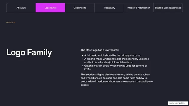
Reusing the exact divider template from the Color section with only the lit tab and title swapped, so chapter openers stay visually identical and the deck feels systemized. Tucking a font-download/request-access link into the divider puts the asset where the reader starts the section.
Reuse notes
A consistent recurring section opener for a long guideline deck. The repeated tab bar is the connective tissue; only change the active tab, the SECTION number, the title, and the intro per chapter.
From this deck: Mash Typography section divider
View deck