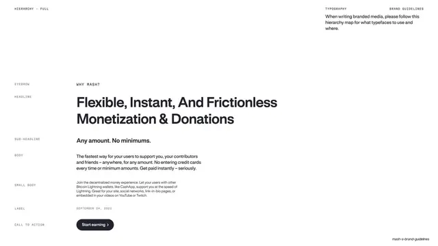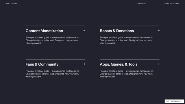
Preview image. Unlock full-res
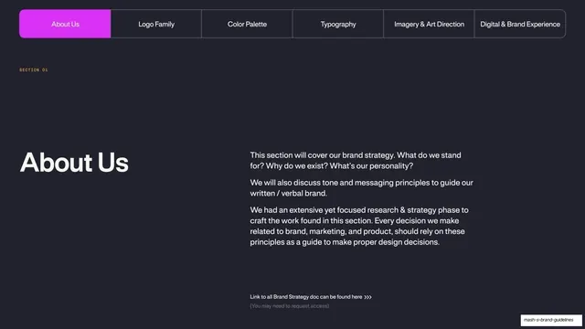
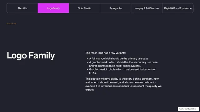
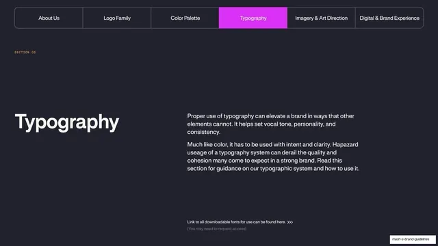
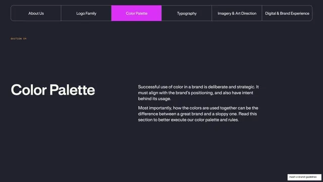
A dark section divider with a tabbed section nav and an oversized "Color Palette" title beside a short intro paragraph.
Summary
The Color Palette section opener: a horizontal tab bar across the top with the Color Palette tab highlighted magenta, then an oversized title on the left and a two-paragraph intro on the right.
Visual description
Near-black ground. A full-width rounded tab bar runs across the top with six section labels (About Us, Logo Family, Color Palette, Typography, Imagery & Art Direction, Digital & Brand Experience); the active "Color Palette" tab is filled bright magenta. A small monospace "SECTION 04" sits below it. Lower left, an oversized white "Color Palette" headline; to its right, two short paragraphs in lighter sans-serif explaining that color use must be deliberate, strategic, and aligned with positioning. Generous empty space below.
Key takeaway
Using a persistent tabbed section bar as the divider, with the current section lit in the brand accent, so every chapter opener doubles as a table of contents and a wayfinding cue. The oversized title plus a single intro paragraph keeps dividers calm.
Reuse notes
A strong recurring divider pattern for multi-section guideline or report decks. The lit-tab navigation reads best when the same bar repeats on every section opener; reserve the accent fill for the active chapter only.
From this deck: Mash Color Palette section divider
View deck