Preview image. Unlock full-res
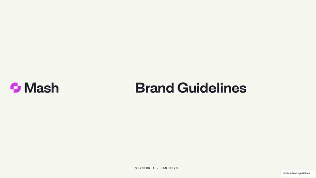
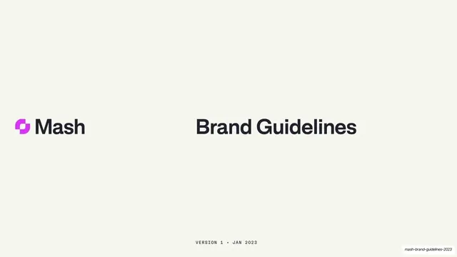
Cream title page with the Mash logo and magenta mark on the left and a bold "Brand Guidelines" headline on the right.
Summary
The title page: a calm cream field with the Mash lockup on the left and an oversized "Brand Guidelines" headline on the right, footed by a small monospace version line.
Visual description
Warm off-white cream background. The lockup sits at left-center: a magenta interlocking graphic mark beside the dark "Mash" wordmark in a bold neo-grotesque sans. Mirrored on the right is the deck title "Brand Guidelines" set in the same dark bold sans at a large size. Centered along the bottom edge, a tiny all-caps monospace line reads "VERSION 1 . JAN 2023". Generous empty space surrounds both blocks.
Key takeaway
Splitting a cover into a left brand lockup and a right deck title on one horizontal baseline, so the page reads as a balanced pair rather than a stack. The monospace version line as a quiet documentary footer that signals an internal, versioned document.
Reuse notes
A clean, confident opener for any brand book or internal guideline deck. Depends on a strong wordmark and mark to anchor the left side. The two-column balance only holds with this much negative space; crowding either block breaks it.
From this deck: Mash Brand Guidelines cover
View deck













More like this






Keep what you find
A free account saves references to boards and can send you a weekly email of picks based on what you save.
To see every result, go Pro.