Preview image. Unlock full-res
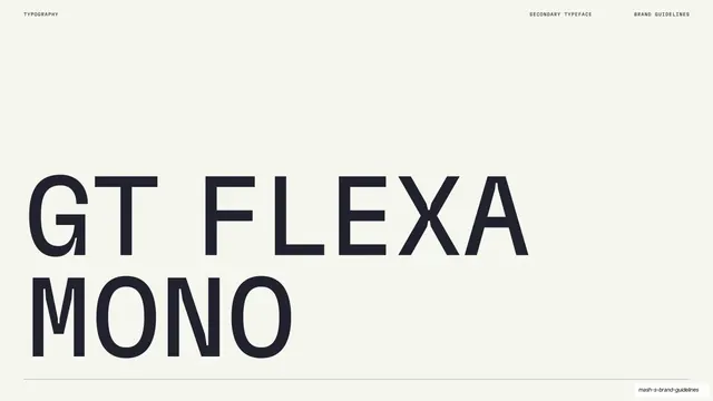
A light slide naming the secondary typeface with "GT FLEXA MONO" set large and all-caps over two lines.
Summary
The secondary-typeface name slide: "GT FLEXA MONO" set large in all-caps across two lines on the lower half, mirroring the primary-type opener.
Visual description
Warm off-white ground, mostly empty. "GT FLEXA" sits on the first line and "MONO" on the second, set very large in dark all-caps with the wide, even spacing of a monospaced grotesque. A thin hairline rule runs full width beneath. A small monospace header reads "TYPOGRAPHY" left, "SECONDARY TYPEFACE" and "BRAND GUIDELINES" right. The layout repeats the primary "Rules" title page exactly, just with the secondary face named.
Key takeaway
Giving the secondary typeface the same oversized name-slide treatment as the primary, so the two type opener pages read as a matched pair and signal equal status in the system. The monospaced caps quietly preview the face's character.
Reuse notes
The opener for a secondary or mono typeface chapter. Reuse the primary type-title layout verbatim for consistency; let the face's own letterforms (here, monospaced caps) hint at its role before the specimen pages.
From this deck: Mash GT Flexa Mono secondary typeface title
View deck



































More like this






Keep what you find
A free account saves references to boards and can send you a weekly email of picks based on what you save.
To see every result, go Pro.