Preview image. Unlock full-res
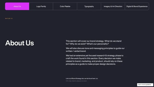
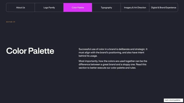
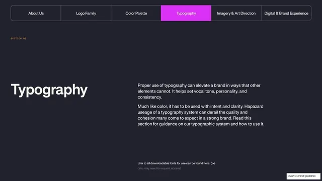
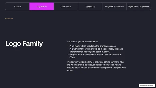
Dark section-opener with the pill tab bar (Logo Family filled magenta) above a big "Logo Family" heading and a bulleted list of the three logo variants.
Summary
The opener for Section 02: the same top tab bar with "Logo Family" now filled magenta, a large "Logo Family" heading at left, and a right column listing the three logo variants and what the section covers.
Visual description
Near-black navy-charcoal background, matching the About Us divider. The full-width segmented pill nav runs across the top with the second segment, "Logo Family", filled solid magenta and the rest outlined. A "SECTION 02" mono tag sits below it. Lower-left, "Logo Family" is set large in a light neo-grotesque sans. The right column opens with "The Mash logo has a few variants:" followed by a three-item bulleted list (full mark, graphic mark, graphic mark in circle) and a short paragraph on how the section will explain the mark's story and usage.
Key takeaway
The section-divider system repeating exactly: identical tab bar, only the active magenta segment moves, identical big-title-left / intro-right layout. This consistency is what makes a long brand book feel navigable. The bulleted variant list previews the section's contents up front.
Reuse notes
The reusable second instance of the divider template. For any multi-section deck, lock one divider layout and change only the active tab and the title; readers learn the pattern after the first one. Pair with a short bullet preview when the section has discrete sub-parts.
From this deck: Logo Family section divider
View deck