Preview image. Unlock full-res
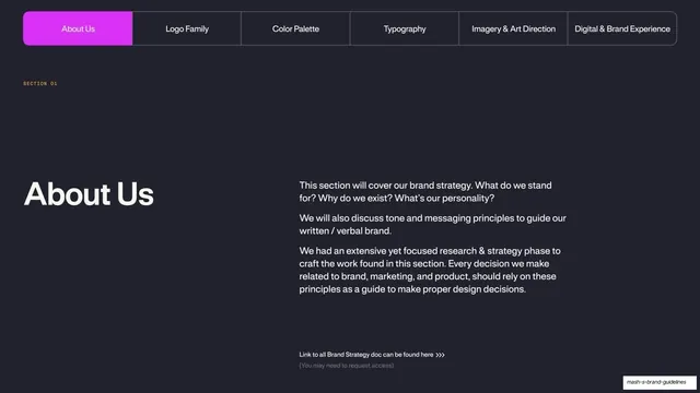
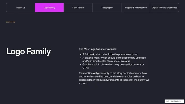
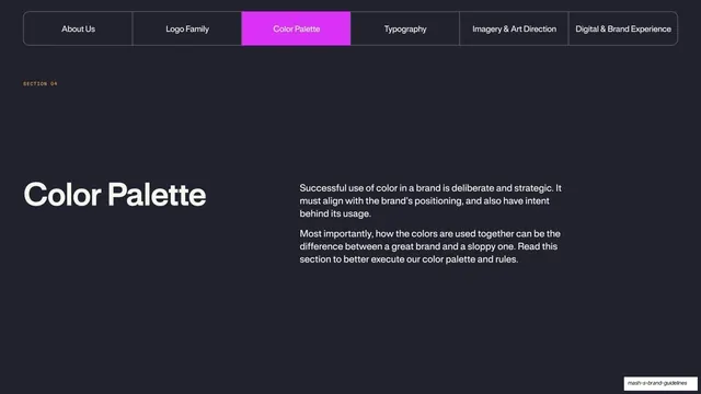
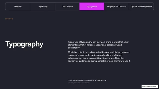
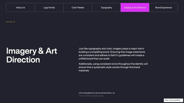
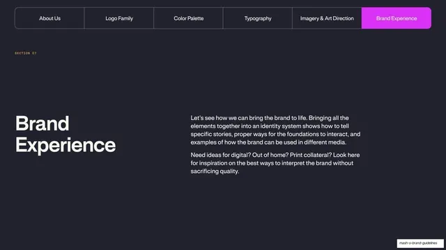
Dark section divider opening Brand Experience, with the full tab-bar and the final tab highlighted magenta.
Summary
The chapter divider for the final Brand Experience section, using the same tab-bar wayfinder with the last tab filled magenta and a large title plus intro below.
Visual description
Near-black full-bleed slide. The full-width pill tab bar runs across the top (About Us, Logo Family, Color Palette, Typography, Imagery & Art Direction, Brand Experience) with the rightmost "Brand Experience" tab filled solid magenta as active. A mono "SECTION 07" label sits below left. The lower half splits: an oversized cream grotesque title "Brand Experience" stacked on two lines at left, and a two-paragraph intro at right describing how the elements come together across digital, out-of-home, and print. Wide dark margins, no imagery.
Key takeaway
The consistency payoff of the recurring tab-bar nav: by the final divider the device reads instantly, and only the magenta highlight has moved. Reusing one divider template for every section is the lesson.
Reuse notes
Confirms the tab-bar wayfinding pattern as the deck's structural backbone; copy it across all section openers. The big-title-left, intro-right split keeps dividers calm and legible. Dark canvas required for the magenta tab to register.
From this deck: Mash Brand Experience divider
View deck