Preview image. Unlock full-res
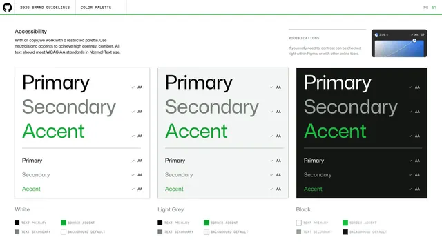
Accessibility page showing Primary, Secondary and Accent text passing WCAG AA on White, Light Grey and Black panels, with a Figma contrast-checker note.
Summary
A color accessibility page demonstrating that Primary, Secondary and Accent text each meet WCAG AA on the three neutral backgrounds, shown as three large type-sample panels with check marks.
Visual description
A short left intro states all copy uses a restricted palette and must meet WCAG AA at normal text size. Three large panels sit side by side on White, Light Grey and Black: each stacks oversized "Primary / Secondary / Accent" words (black, gray, green) above a thin rule, then a smaller repeat of the same three, with a check mark and "AA" beside every line. Top-right a small dark contrast-checker UI tile reads "3.09:1" with a MODIFICATIONS note about checking contrast in Figma. Each panel has the four-swatch role key (Text Primary, Text Secondary, Border Accent, Background Default) beneath it. Standard header and green rule above.
Key takeaway
Showing accessibility as passing samples rather than a rules list: the same three text roles on every background, each marked AA, makes the compliant combinations self-evident.
Reuse notes
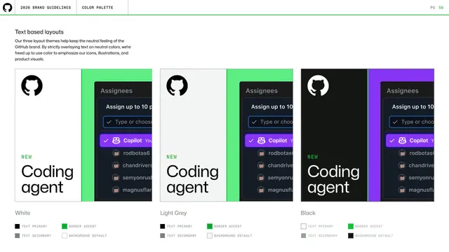
A reassuring, audit-friendly way to document contrast. Pairs naturally with the text-theme page before it; the inline AA badges double as a quick checklist for designers.
From this deck: GitHub guidelines - color accessibility
View deck

























More like this




Keep what you find
A free account saves references to boards and can send you a weekly email of picks based on what you save.
To see every result, go Pro.