Preview image. Unlock full-res
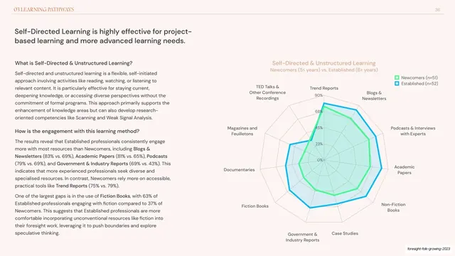
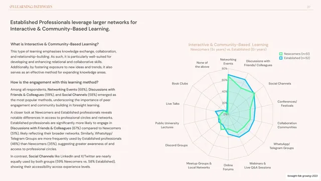
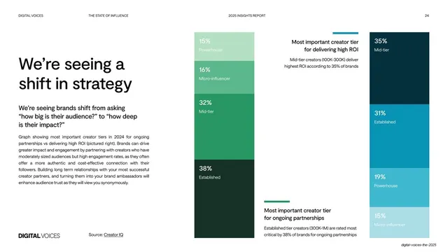
Data slide pairing a left analysis column with a ten-axis radar chart comparing Newcomers and Established on self-directed learning resources.
Summary
The self-directed-learning counterpart to the previous radar slide: a left analysis column under bold sub-questions and a large ten-axis spider chart overlaying Newcomers (green) and Established (blue), where the blue series clearly engulfs the green.
Visual description
Cream background, hairline running header (chapter label left, "36" right). A two-line dark headline tops the slide. The left third repeats the structured format: bold sub-headings ("What is Self-Directed & Unstructured Learning?", "How is the engagement with this learning method?") each followed by a paragraph with inline bold data callouts. The right two-thirds is a ten-spoke radar chart titled "Self-Directed & Unstructured Learning" with axes such as Trend Reports, Blogs & Newsletters, Podcasts & Interviews, Academic Papers, Non-Fiction Books, Case Studies, Government & Industry Reports, Fiction Books, Documentaries and Magazines. The blue Established polygon (n=52) sits well outside the green Newcomers polygon (n=51) on most axes, with a small legend keying both. Grey question footnote below; deck-slug annotation bottom-right.
Key takeaway
Reusing the exact radar-and-text template across two learning methods so the pair reads as a matched set, then letting a many-axis radar tell a one-glance story: here the Established polygon almost entirely contains the Newcomers one, showing broader engagement everywhere. Consistent green/blue cohort colors carry meaning from the previous slide.
Reuse notes
Ten axes is near the upper limit for a legible radar; it works here only because the two shapes nest cleanly and the takeaway is "one bigger than the other". When series cross repeatedly, a radar gets unreadable and bars are safer. Keep cohort colors and the sub-heading scaffold identical to the paired slide so the two compare directly.
From this deck: Self-directed learning radar chart Newcomers vs Established
View deck



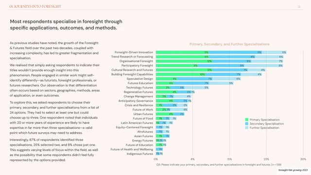

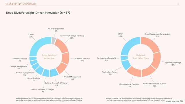
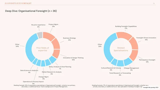
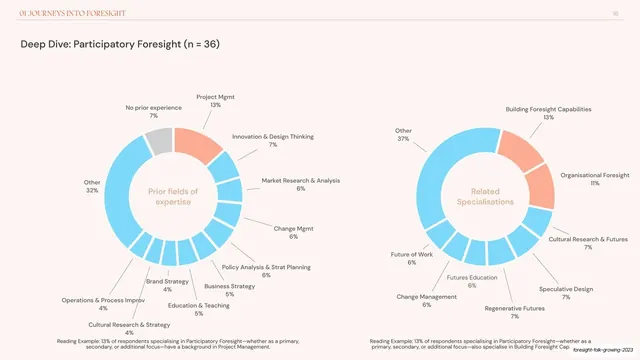




















More like this







Keep what you find
A free account saves references to boards and can send you a weekly email of picks based on what you save.
To see every result, go Pro.