Preview image. Unlock full-res
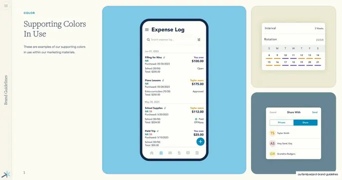
Examples of the supporting palette applied in product UI, shown as app screens nested on colored panels in an asymmetric arrangement.
Summary
A "colors in use" page showing the supporting palette inside real product UI: an Expense Log phone screen and two scheduling/sharing UI cards sit on differently colored panels.
Visual description
Two-column layout. Left: teal eyebrow "COLOR", serif heading "Supporting Colors In Use" over two rows, and a short grey paragraph noting these are examples within marketing materials. Right: an asymmetric composition of three panels. A large sky-blue panel holds a full phone mockup of an "Expense Log" screen (list of expenses with amounts and statuses). To its right, a top beige panel holds a scheduling card (Interval / Rotation with a date grid) and a bottom slate panel holds a "Share With" card listing people. The supporting accents appear as small status colors and underline ticks inside the UI. Page number "1" bottom-left; "Brand Guidelines" label and spark mark on the left edge.
Key takeaway
Showing the palette living inside actual product screens rather than as abstract swatches, with each mockup floated on a brand-colored panel so the colors are demonstrated in context and as backgrounds at once.
Reuse notes
A persuasive "in situ" page for any guideline; proves the system works in product, not just on a swatch sheet. Needs real or realistic UI mockups to carry it. The colored-panel-behind-mockup treatment is a reusable way to frame screens on a slide.
From this deck: Supporting Colors In Use mockups
View deck


More like this


Keep what you find
A free account saves references to boards and can send you a weekly email of picks based on what you save.
To see every result, go Pro.