Preview image. Unlock full-res
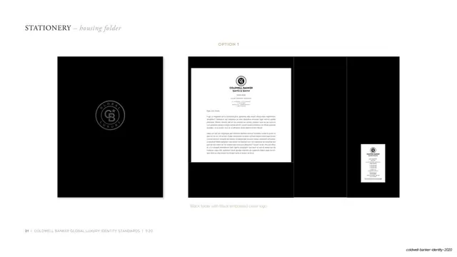
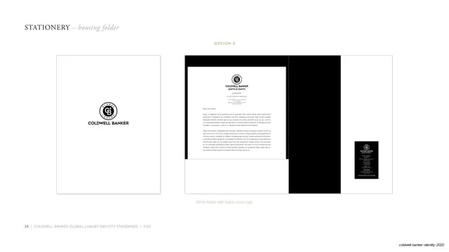
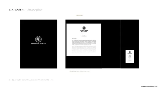
Stationery page showing a black presentation folder with a white crest and wordmark on the cover beside the same open inside view.
Summary
The second folder variant (Option 2): a closed black folder showing a white crest and "COLDWELL BANKER" wordmark on the cover, with the same open-inside view on the right.
Visual description
White page laid out like Option 1. Serif small-caps "STATIONERY" header, italic "housing folder", and a centered tan "OPTION 2" subhead. The left mockup is a closed portrait black folder, but here the circular crest and a "COLDWELL BANKER" wordmark are reversed out in crisp white on the cover, making the mark fully visible. The right mockup repeats the open, unfolded black folder with its pocket holding a white letterhead sheet and a tucked business card. A small tan caption reads "Black folder with white cover logo." Hairline rule and page footer at bottom left.
Key takeaway
Documenting the same folder format with a high-visibility white mark instead of the tonal emboss: showing the embossed and the reversed-logo covers as parallel pages lets the brand offer a discreet and a bold version of the identical object, with the interior kept constant.
Reuse notes
The middle option in the three-folder set. Reuse when a brand wants a more legible, lower-cost printed cover alongside a premium embossed one. Keep the open-inside view identical across all three folder pages so only the cover treatment changes.
From this deck: Housing folder option 2 white logo
View deck