Preview image. Unlock full-res
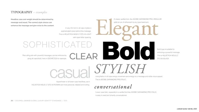
Type-mood page scattering single descriptor words (Elegant, Bold, Sophisticated, Stylish, casual) each set in a different font and weight to show tone.
Summary
A page that demonstrates typographic tone by setting individual mood words in different faces and weights, each annotated with the font and the feeling it conveys.
Visual description
White page, serif small-caps header "TYPOGRAPHY" with italic "examples" top left, and a short bold intro paragraph beneath it. The body is an asymmetric, loosely overlapping field of large words, each set in a different treatment: a tan serif "Elegant", a heavy black sans "Bold", a thin light-grey all-caps "SOPHISTICATED", a grey serif italic "STYLISH", a grey all-caps "CLEAR", a soft grey lowercase "casual", and an italic script "conversational". Each word is paired with a few lines of small grey caption naming the exact font and weight (Adobe Garamond Pro Regular, Helvetica Neue LT Std 95 Black, Helvetica Neue LT Std 45 Light, Geometos, etc.) and the mood it produces. The arrangement is deliberately uneven, with words at varying sizes filling the space. Hairline rule and page footer at bottom left.
Key takeaway
Using the descriptor word itself as the specimen: each adjective is rendered in the type treatment that embodies it, so the page shows the tone instead of describing it. The scattered, size-varied layout reads as a moodboard while still being a precise spec.
Reuse notes
A memorable way to do the tone-of-voice or type-mood page of an identity guideline. Works best with a family of contrasting faces (refined serif, heavy sans, script) so the words feel distinct. Keep captions tight and factual so it stays a reference, not just decoration.
From this deck: Typography mood examples
View deck