Preview image. Unlock full-res
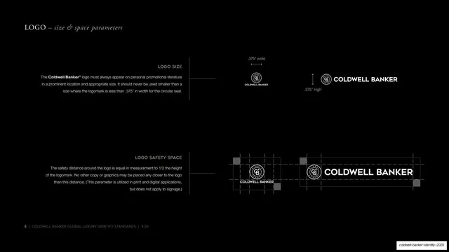
A black technical page diagramming minimum logo size and clear-space rules with measurement callouts and a clearance grid around the lockup.
Summary
The logo mechanics page: minimum-size rules (top) and safety-space rules (bottom) on black, each with a right-aligned descriptor and small white diagrams carrying measurement callouts.
Visual description
On black, "LOGO - size & space parameters" sits top-left in Garamond small caps and italic. Two bands stack down the page. The upper "LOGO SIZE" band pairs a right-aligned gray paragraph with small white horizontal and stacked lockups annotated by ".375" wide" and ".375" high" dimension lines. The lower "LOGO SAFETY SPACE" band pairs its paragraph with two diagrams of the lockups wrapped in a faint clearance grid, the exclusion zone marked by small gray corner squares. Thin connector rules link copy to diagrams; a page-numbered footer runs along the bottom.
Key takeaway
Expressing clear-space as a literal grid of corner markers around the mark, and minimum size as a dimensioned callout, communicates the rule instantly without dense text. The consistent copy-to-connector-to-diagram band makes a dry mechanics page look engineered.
Reuse notes
A standard, reusable clear-space and minimum-size template for any brand book. The faint construction grid plus dimension lines is the conventional, expected way to spec these rules. Keep the diagrams small and the background dark so the white guides read cleanly.
From this deck: Logo size and space parameters
View deck