Preview image. Unlock full-res
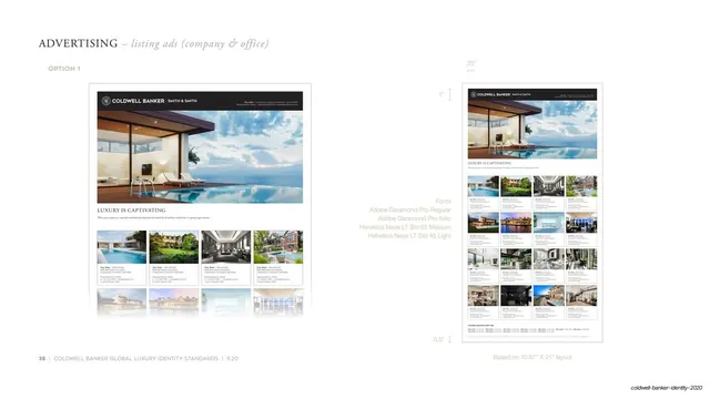
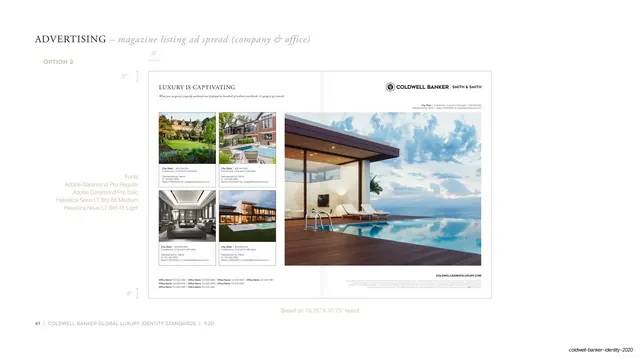
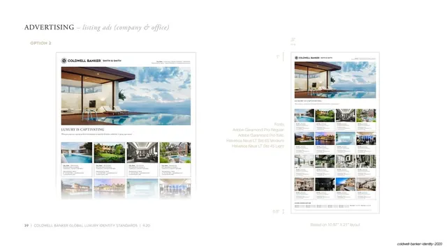
Guideline page for listing ad option 2, a hero photo over a thumbnail listing grid with a white header lockup, annotated with margins and the brand font stack.
Summary
The companion to the previous page: "Option 2" of the company and office listing ad, the same hero-photo-over-thumbnail-grid structure but with a white header lockup instead of a dark bar, shown clean and again with dimension guides.
Visual description
Near-white page, serif "ADVERTISING" header with italic "listing ads (company & office)" and a gold "OPTION 2" label. The left comp opens with a white header carrying the black crest and "COLDWELL BANKER | SMITH & SMITH" lockup, then a wide twilight photo of a modern glass house and pool, the serif "LUXURY IS CAPTIVATING" headline, and a four-column grid of captioned property thumbnails. On the right the ad repeats at reduced size, ringed by hairline measurement guides (".5"", "1"", ".5""). The same gray font-stack note appears (Adobe Garamond Pro Regular and Italic, Helvetica Neue LT Std 65 Medium and 45 Light), with the footer line "Based on 10.87" X 21" layout" and page number 39.
Key takeaway
The light header variant shows how the same listing template flips from a dark to a white masthead while keeping the grid intact, a useful way to document brand flexibility. Pairing a clean comp with an annotated one again keeps spec and look together on one page.
Reuse notes
Use alongside the option-1 page when a brand book needs to present a dark-header and a light-header version of the same ad. The thumbnail grid and Garamond-Helvetica pairing carry the luxury read; weak photography would undercut it.
From this deck: Listing ad template option 2 with measurements
View deck