Preview image. Unlock full-res
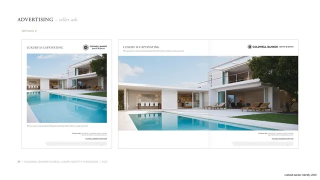
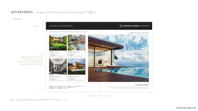
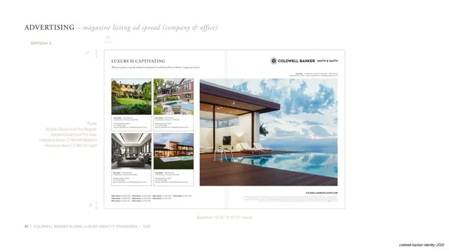
Guideline page for magazine spread option 2, the same left-grid right-hero layout but with a white masthead and a black crest lockup instead of a dark band.
Summary
The light-masthead counterpart to the prior spread: "Option 2" of the two-page magazine listing ad, keeping the left thumbnail grid and right twilight hero photo but swapping the dark band for a white header with a black crest lockup.
Visual description
Near-white page, serif "ADVERTISING" header with italic "magazine listing ad spread (company & office)" and a gold "OPTION 2" label. The horizontal spread sits in a hairline frame. Across the top, on white, the serif "LUXURY IS CAPTIVATING" headline at left and the black crest plus "COLDWELL BANKER | SMITH & SMITH" lockup at right, with small property and contact lines beneath. The left page carries the 2x2 grid of captioned property photos; the right page is the same tall twilight image of a glass house and infinity pool. The "COLDWELLBANKERLUXURY.COM" url and gray legal text sit lower right. Margin guides (".5"") frame the top-left, the gray Garamond/Helvetica font-stack note sits center-left, and the footer reads "Based on 16.25" X 10.75" layout" with page number 41.
Key takeaway
The direct dark-versus-light comparison across two consecutive spec pages, holding everything else constant so the only variable is the masthead treatment. It makes the brand's two-route flexibility obvious at a glance.
Reuse notes
Pairs with the option-1 spread for any guideline that documents a dark and a light version of a magazine layout. The white masthead reads cleaner and more open; choose it when the hero photo already carries enough drama. Same dependence on premium photography and the Garamond-Helvetica type system.
From this deck: Magazine listing ad spread option 2
View deck