Preview image. Unlock full-res
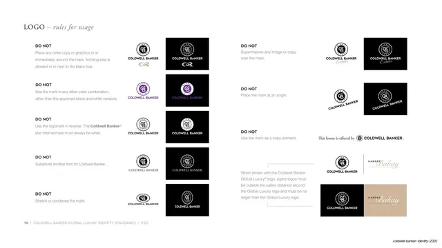
A white misuse page laying out a grid of DO NOT examples, each pairing a short rule with a positive and inverted incorrect logo treatment.
Summary
The logo misuse page: a two-block grid of "DO NOT" rules on white, each rule paired with a small example shown both on white and on black, covering wrong copy, wrong color, reversed marks, wrong fonts, stretching, angling, and agent-logo spacing.
Visual description
On white, "LOGO - rules for usage" sits top-left in Garamond. Two columns of stacked entries each begin with a bold all-caps "DO NOT" and a short gray rule (do not place other copy near the mark, do not recolor, do not reverse the logomark, do not substitute the font, do not stretch or condense, do not superimpose over imagery, do not angle, do not use as a copy element). To the right of each rule sit small example pairs, the same incorrect treatment shown once on white and once on a black swatch, including a purple-tinted misuse and tan "Estates" and "Harper Bakay" agent-logo examples. The lower-right block illustrates correct agent-logo safe spacing beside the master mark. A page-numbered footer runs along the bottom.
Key takeaway
Showing each prohibition twice, on white and on black, proves the violation reads the same on either surface. The dense but orderly two-column DO NOT grid packs many rules onto one page without feeling cluttered, thanks to consistent rule-then-example modules.
Reuse notes
The conventional, expected misuse page for any brand book, and a clean way to compress a long list of don'ts. Reusable as-is structurally. Keep examples small and uniform; the value is in showing the wrong result, so each example must be unambiguously incorrect.
From this deck: Logo rules for usage - do not grid
View deck