Preview image. Unlock full-res
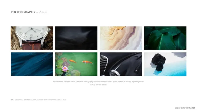
White page of eight close-up detail photos (watch, leaves, stone, koi) in a 4x2 grid under a serif header with a centered caption.
Summary
The detail-photography example page: eight tightly cropped lifestyle close-ups in the same four-by-two grid on white, headed by the serif label and a centered caption.
Visual description
White page with the serif small-caps header "PHOTOGRAPHY" and an italic "details" top left. Eight equal landscape photos fill a four-column, two-row grid with even gutters and generous white margins. The shots are close-up textures and objects rather than rooms: a wristwatch on rich soil, folded black fabric, swirling stone, deep green leaves, blue feathers, koi and a lotus in a green pond, a chrome detail of a black classic car, and a chunk of dark coal on icy blue. Color is vivid and the textures are tactile. A centered two-line grey caption reads "Rich textures, delicious colors... Luxury is in the details." Hairline rule and page footer at bottom left.
Key takeaway
Extending the same eight-up grid to abstract detail and texture shots, not just property photos: it teaches that the brand's imagery includes mood and material close-ups, while the repeated grid keeps the whole photography section visually unified. The "Luxury is in the details" caption ties the format to the idea.
Reuse notes
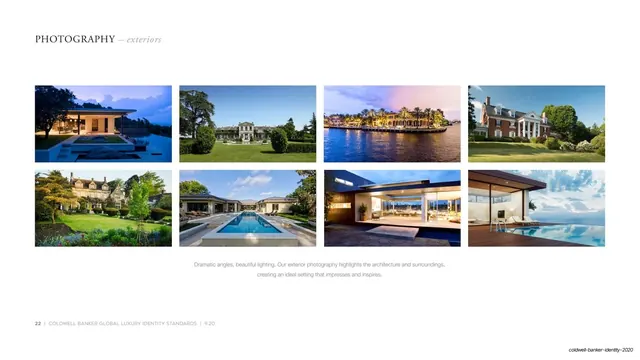
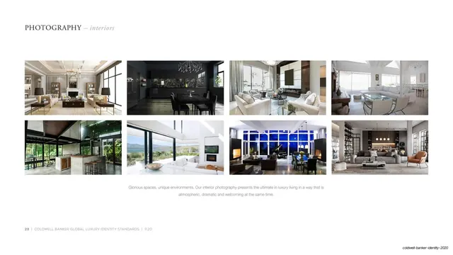
Completes a three-page photography set (exteriors, interiors, details) all on the same grid. Reuse the detail-shot page anytime a brand wants to define a supporting texture or lifestyle library beyond its hero subjects. Needs genuinely striking, color-rich close-ups; weak or literal detail shots make the page feel like filler.
From this deck: Photography details grid
View deck