Preview image. Unlock full-res
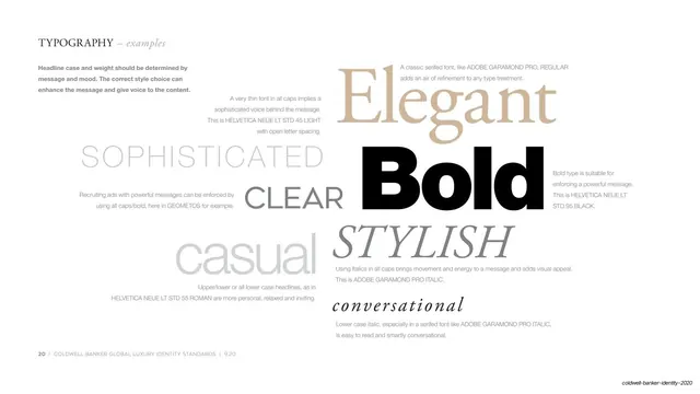
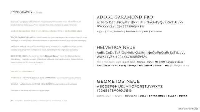
Type-family page pairing a left explainer column with three large stacked specimens (Adobe Garamond Pro, Helvetica Neue, Geometos Neue) on white.
Summary
A typography specification page that lays out the three brand font families, each shown as a large name plus full glyph set and weight list, with a narrow column of explanatory copy on the left.
Visual description
White page with a serif small-caps section header "TYPOGRAPHY" followed by an italic "fonts" in a refined serif, top left. The left third is a column of body copy in small grey sans-serif, with gold-tan subheads ("ADOBE GARAMOND PRO | HELVETICA NEUE LT STD | GEOMETOS NEUE", "DIGITAL ALTERNATIVES", "WEBSITES", "EMAILS") breaking the text into blocks. The right two-thirds stacks three font specimens vertically: Adobe Garamond Pro set as a large serif name over its alphabet and a weight list (Regular, Italic, Semibold, Bold), then Helvetica Neue as a large sans name over its alphabet and a long weight list noting "51 weights in all", then Geometos Neue as a geometric all-caps display name over its uppercase set and weight names. Generous white space separates each specimen. A thin hairline rule and a small page footer ("19 | COLDWELL BANKER GLOBAL LUXURY IDENTITY STANDARDS | 9.20") sit at the bottom left.
Key takeaway
The left-rail-of-reasoning / right-rail-of-evidence split: prose argument on the left, big legible specimens on the right, so the page teaches and demonstrates at once. Gold-tan subheads as the only color do all the wayfinding inside an otherwise black-on-white page.
Reuse notes
A clean template for the type page of any brand or identity guideline, especially luxury or editorial systems that mix a serif, a neutral sans, and a display face. Scales to two or four families by adding or removing specimen rows. The single metallic accent color keeps it from looking like a plain spec sheet.
From this deck: Typography fonts specimen
View deck