Preview image. Unlock full-res
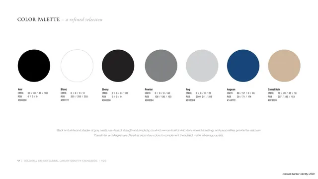
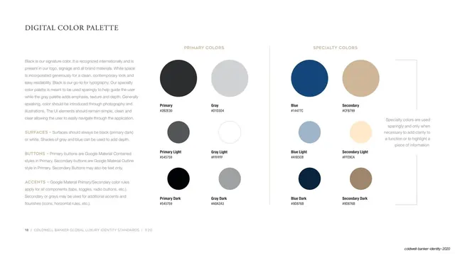
A white page mapping digital primary and specialty colors into a two-by-three swatch grid with hex codes and left-column usage rules for surfaces, buttons, and accents.
Summary
The digital color page: a left column of UI usage rules (surfaces, buttons, accents) beside two swatch grids, Primary colors (grays) and Specialty colors (blues and tans), each circle labeled with a name and hex.
Visual description
On white, "DIGITAL COLOR PALETTE" sits top-left in Garamond. The left third is gray sans body copy explaining that black is the signature color, surfaces stay black or white, buttons follow Google Material styles, and accents use specialty or gray. The right two-thirds holds two labeled groups of circular swatches. "PRIMARY COLORS" lists Primary, Gray, Primary Light, Gray Light, Primary Dark, and Gray Dark across a two-by-three grid; "SPECIALTY COLORS" lists Blue, Secondary (tan), Blue Light, Secondary Light, Blue Dark, and Secondary Dark, each with its hex code beneath. A small right-margin note explains specialty colors are used sparingly. A page-numbered footer runs along the bottom.
Key takeaway
Splitting the on-screen palette into a "primary" gray system and a "specialty" accent system, with explicit surface/button/accent rules, translates a print identity into a usable UI token set. Tying buttons to Material styles keeps the digital guidance practical for product teams.
Reuse notes
A solid digital-palette page for brands that need both print and screen guidance. The primary-versus-specialty split and named light/dark variants map cleanly onto design tokens. Reuse the structure for any UI color system; pair with the print palette page so the two stay reconciled.
From this deck: Digital color palette
View deck