Preview image. Unlock full-res
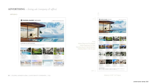
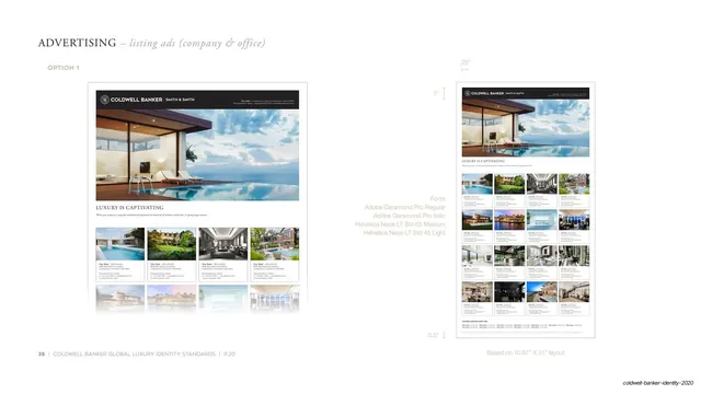
Guideline page specifying a company/office listing ad: a hero property photo above a thumbnail grid of listings, annotated with margin measurements and the brand font stack.
Summary
An identity-standards page documenting "Option 1" of the company and office listing advertisement: a large hero property image sitting above a four-across grid of listing thumbnails, shown twice with margin and dimension annotations.
Visual description
Near-white page with the serif "ADVERTISING" header and italic "listing ads (company & office)" plus a gold "OPTION 1" label. On the left, a portrait ad comp: a dark Coldwell Banker header bar with the crest and "SMITH & SMITH" runs across the top, then a wide twilight photo of a glass house and pool, then the serif "LUXURY IS CAPTIVATING" headline, then a four-column grid of small property thumbnails each with bold caption lines. On the right the same ad is repeated smaller, surrounded by thin measurement guides ("1"", ".25"", ".5"") that call out margins and spacing. A gray side note lists the font stack: "Adobe Garamond Pro Regular / Adobe Garamond Pro Italic / Helvetica Neue LT Std 65 Medium / Helvetica Neue LT Std 45 Light", and the footer notes "Based on 10.87" X 21" layout" alongside the page number 38.
Key takeaway
Documenting a layout twice, once clean and once wrapped in dimension guides, so the reader sees both the finished look and the exact spec. The hero-photo-over-thumbnail-grid structure is a tidy way to lead with one statement listing while still showing inventory.
Reuse notes
A model for brand-book ad templates where margins, grid, and type must be pinned down precisely. The dimension annotations and font callouts are reusable for any print spec page. Needs the same Garamond-plus-Helvetica pairing to read as intended.
From this deck: Listing ad template option 1 with measurements
View deck