Preview image. Unlock full-res
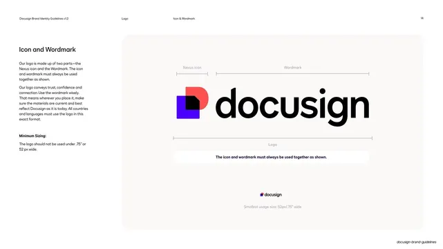
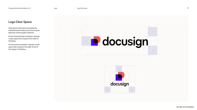
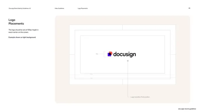
Light page with a left explainer column and a cream panel showing the Docusign logo measured into Nexus icon plus wordmark, with a minimum-size example.
Summary
The logo anatomy page: a white layout with a left explainer column and a large cream panel showing the full Docusign logo broken into its two parts via measurement brackets, the Nexus icon and the wordmark, plus a minimum-size example.
Visual description
White background, thin running header. The left column reads "Icon and Wordmark" over grey paragraphs explaining the logo's two parts and a bold "Minimum Sizing:" note (not under .75" / 52px wide). The right two-thirds is a soft cream rounded panel. The full lockup, the multi-color Nexus icon (cobalt square, poppy "D" monogram, white dog-ear) beside the black "docusign" wordmark, is centered with thin labeled measurement brackets above marking "Nexus icon" and "Wordmark" and one below marking the whole "Logo". A small reassurance bar reads "The icon and wordmark must always be used together as shown", and a tiny logo at the bottom demonstrates the minimum size.
Key takeaway
The measurement-bracket anatomy diagram that names each part of a lockup and visually fixes their relationship, the canonical way to specify a logo. Showing the minimum-size mark at actual small scale in the same panel makes the rule concrete.
Reuse notes
The standard logo-construction page for any identity guideline. Reuse the bracket-labeling system for clear space, sizing, and anatomy pages. The cream panel keeps the mark legible; put dark-background logo variants on their own page.
From this deck: Icon and wordmark anatomy
View deck
























More like this
Keep what you find
A free account saves references to boards and can send you a weekly email of picks based on what you save.
To see every result, go Pro.