Preview image. Unlock full-res
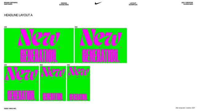
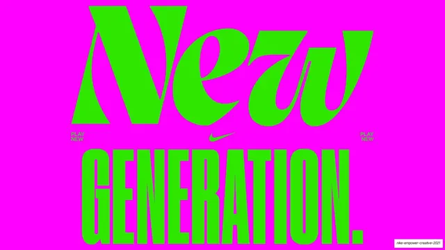
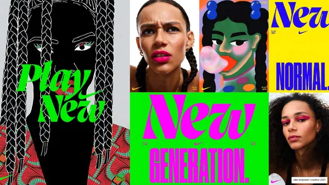
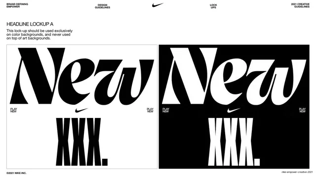
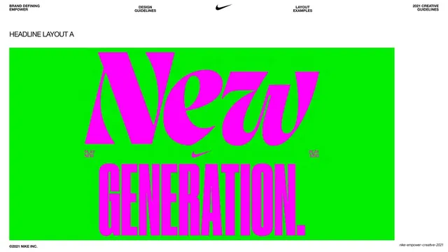
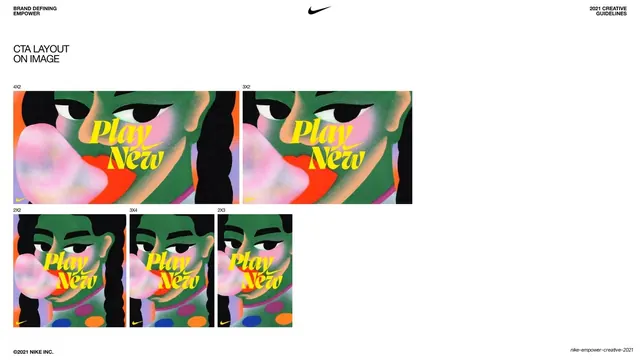
A white page demonstrating Headline Layout A across five aspect ratios (4x2, 3x2, 2x2, 3x4, 2x3) as green panels with the magenta New / Generation lockup.
Summary
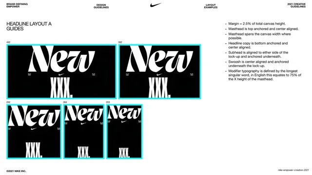
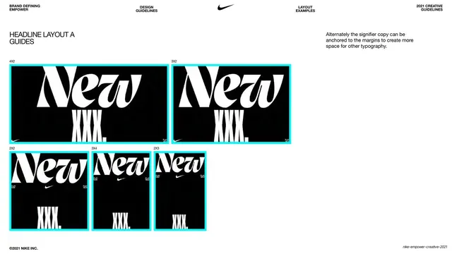
A responsive-sizing page showing the same Headline Layout A lockup adapted to five aspect ratios, each panel labeled with its ratio.
Visual description
White background, standard running header and left-aligned "HEADLINE LAYOUT A" label. Below, the green "New / Generation." lockup is repeated at five sizes laid out in two rows: a top row of two wide panels labeled "4X2" and "3X2", and a bottom row of three more upright panels labeled "2X2", "3X4" and "2X3". Each green panel keeps the magenta italic "New" masthead up top and condensed "GENERATION." modifier at the base, with the lockup scaling and cropping to suit each frame; the modifier shrinks noticeably in the narrowest formats. Footer: "©2021 NIKE INC." left, "nike-empower-creative-2021" right.
Key takeaway
Documenting a headline lockup across a fixed set of named aspect ratios so production teams know exactly how it reflows from wide banner to square to tall. Keeping the masthead constant while the modifier scales shows the system's priority order.
Reuse notes
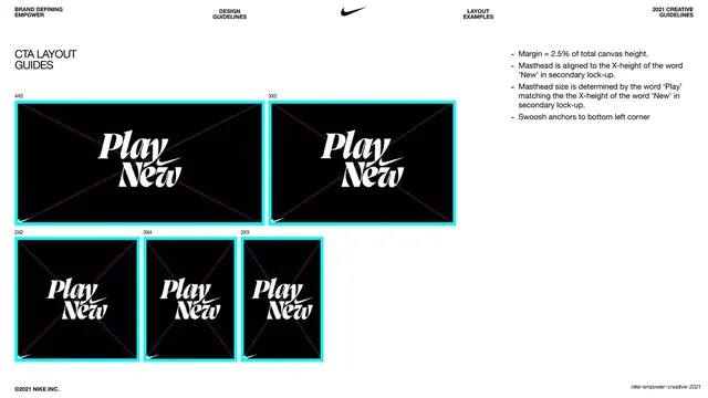
A practical template for any responsive type or layout spec that has to ship across many placement sizes. The labeled-ratio grid is directly reusable; populate it with your own lockup. Pair with the guides page that overlays the same ratios with rules.
From this deck: Nike Empower Headline Layout A aspect ratios
View deck





















More like this
Keep what you find
A free account saves references to boards and can send you a weekly email of picks based on what you save.
To see every result, go Pro.