
Preview image. Unlock full-res
A 2x3 grid showing the horizontal ARTHAUS mark in six approved finishes: black-and-white, on color, on gradient, type-style variation, over image, and as an image mask.
Summary
Six captioned cells laying out the approved ways to render the horizontal ARTHAUS logotype: reversed white-on-black, black on a red field, black on a green gradient, a typographic-style variation, the mark over a marbled image, and the mark cutting an image as a mask.
Visual description
White full bleed with a rotated "USOS" side label up the left edge. A 2x3 grid of swatches, each with a small grey caption beneath. Top row: "Logotipo blanco y negro" (white mark on solid black), "Logotipo sobre color" (black mark on flat orange-red), "Logotipo sobre degradado" (black mark on a lime-to-green gradient). Bottom row: "Variacion de los estilos tipograficos" (a heavier, distorted cut of the mark on pale grey), "Logotipo sobre imagen" (white mark over a teal-and-orange marbled fluid photo), "Logotipo como mascara" (the same marbled image showing only through the letterforms). The wordmark keeps its signature square negative space between ART and HAUS in every cell.
Key takeaway
Packaging every legitimate color and finish treatment into one tidy captioned 2x3 board, including the more expressive moves (gradient, over-image, image-as-mask) so the brand reads as flexible rather than locked. Keeping the same mark constant while only the fill changes makes the variations legible at a glance.
Reuse notes
A reusable "approved versions" page for any identity that wants to license color, gradient, photographic, and mask treatments of a single mark. Works best with a bold, high-coverage logotype whose counters can carry an image mask.
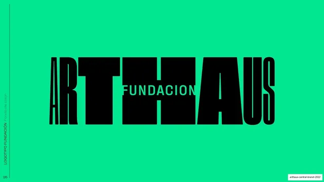
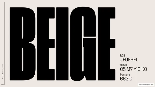
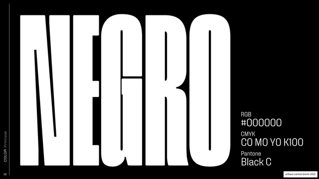
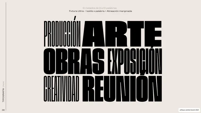
From this deck: ARTHAUS logo color and finish variations
View deck



































More like this








Keep what you find
A free account saves references to boards and can send you a weekly email of picks based on what you save.
To see every result, go Pro.