Preview image. Unlock full-res
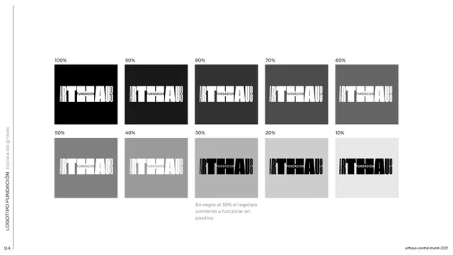
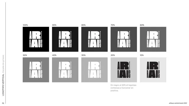
A 2x5 grid stepping the Fundacion lockup across black tints from 100 to 10 percent, showing where the mark flips from negative to positive.
Summary
A grayscale visibility chart for the Fundacion lockup: ten swatches from 100 percent black down to 10 percent, demonstrating the contrast point where the logo should switch from reversed to positive.
Visual description
White full bleed with a rotated "LOGOTIPO FUNDACION / Escala de grises" side label up the left edge. Two rows of five square swatches, each labeled with a percentage above (100, 90, 80, 70, 60 on top; 50, 40, 30, 20, 10 below). In the darker swatches the ARTHAUS Fundacion mark is reversed in white; as the background lightens it stays white until around 40 percent, then the mark renders in black for legibility. A small grey note near the 30 percent swatch reads "En negro al 30% el logotipo comienza a funcionar en positivo."
Key takeaway
Turning an abstract contrast rule into a literal stepped tint chart with one annotated tipping point, so anyone can see exactly when to swap the mark from light to dark. The 2x5 percentage grid is a clean, reusable diagnostic format.
Reuse notes
Useful for any guideline that needs to specify minimum background contrast for a logo, especially on variable grey or tinted surfaces. The annotated threshold swatch is the key teaching moment; keep that callout when adapting.
From this deck: ARTHAUS Fundacion grayscale contrast scale
View deck




































More like this








Keep what you find
A free account saves references to boards and can send you a weekly email of picks based on what you save.
To see every result, go Pro.