Preview image. Unlock full-res
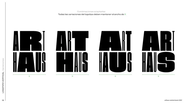
Four side-by-side vertical ARTHAUS lockups showing approved letter-shape variations, each held to the same width X by a green measurement bracket.
Summary
A row of four approved vertical ARTHAUS lockups, each with differently weighted and proportioned letterforms but all locked to the same overall width, marked by a green bracket beneath each.
Visual description
White full bleed with a rotated all-caps side label up the left edge ("LOGOTIPO VERTICAL / Variaciones"). Centered top, a thin centered caption reads "Combinaciones aceptadas / Todas las variaciones del logotipo deben mantener el ancho de X" with the X in green. Below sit four stacked "ART / HAUS" lockups in heavy black condensed display type, each a legitimate variant: the letters get progressively wider, rounder, and more tightly packed left to right while keeping the two-line structure. A bright green horizontal measurement bracket with an "X" label runs under each lockup, asserting equal width across all four.
Key takeaway
Demonstrating a flexible, variable logotype by lining up several legal cuts in a single row and unifying them with one shared constraint (constant width). The single green accent does all the annotating against an otherwise pure black-and-white layout.
Reuse notes
Ideal for brands with an intentionally flexible or "living" logotype that needs to show range while fencing it with one hard rule. The four-up comparison grid and green measure-bracket pattern transfer to any variation or do/constraint page.
From this deck: ARTHAUS approved vertical variations
View deck


































More like this








Keep what you find
A free account saves references to boards and can send you a weekly email of picks based on what you save.
To see every result, go Pro.