Preview image. Unlock full-res
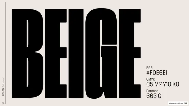
Primary-color page for beige, with the word BEIGE set huge in black and RGB, CMYK, and Pantone values stacked at the right.
Summary
The primary beige color page: the swatch is the whole slide, with the word BEIGE set at enormous scale in black and the color values listed compactly at the right.
Visual description
The full bleed is the beige itself (a warm off-white). A small rotated "COLOR / Principal" label runs up the left edge. The word "BEIGE" is set in a heavy condensed black display face at huge scale, filling most of the width with tightly interlocking letters. In the lower right, three small specs stack in a mixed mono/sans utility style: "RGB #F0E6E1", "CMYK C5 M7 Y10 K0", "Pantone 663 C", each with a tiny grey label above the value.
Key takeaway
Letting the color fill the entire canvas and naming it in one giant word, so the swatch and its label are the same object. Tucking the technical values into a quiet corner keeps the page bold while staying spec-complete.
Reuse notes
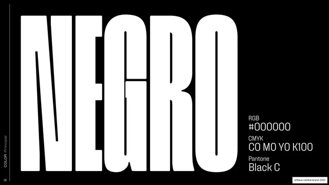
A confident format for a primary-color page in a brand book: full-bleed swatch, oversized color name, corner specs. Works best for each hero color on its own slide (as this deck does for beige, black, and white). The giant-name device only reads on flat, single-color grounds.
From this deck: BEIGE primary color swatch
View deck















































More like this









Keep what you find
A free account saves references to boards and can send you a weekly email of picks based on what you save.
To see every result, go Pro.