Preview image. Unlock full-res
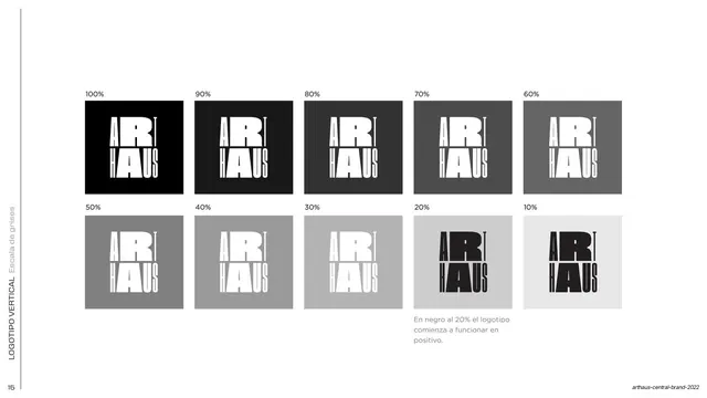
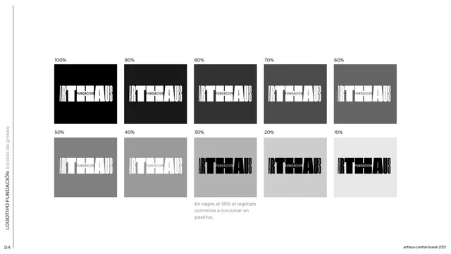
A 10-step grayscale grid from 100% to 10% testing the vertical logotype's legibility, noting it flips to positive at 20%.
Summary
A grayscale contrast test for the vertical lockup: the stacked ARTHAUS mark shown on ten gray swatches from 100% to 10%, marking where it flips from negative to positive.
Visual description
White background. Ten square swatches sit in two rows of five, labeled 100% down to 10%. Each carries a small stacked ART-over-HAUS lockup; on the darker swatches (100%-30%) the mark is white, and at 20% and 10% it switches to black. A small gray Spanish note under the 20% swatch states that at 20% black the logo begins to work in positive. A rotated label and page number "15" sit in the left margin.
Key takeaway
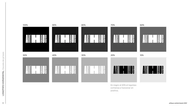
Repeating the exact grayscale ramp used for the horizontal mark, now for the vertical one, so both lockups carry the same documented contrast threshold. Consistency across the two specimens is the point.
Reuse notes
The vertical-lockup twin of the earlier horizontal grayscale page. Reusable as a contrast/legibility spec; keeping both lockups on the same ramp is good practice for a multi-lockup identity.
From this deck: Vertical logotype grayscale scale
View deck


































More like this







Keep what you find
A free account saves references to boards and can send you a weekly email of picks based on what you save.
To see every result, go Pro.