
Preview image. Unlock full-res
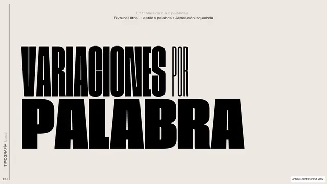
Dark typography rule slide where the word VARIACION is set in Fixture Ultra with every letter a different style and the accented O kicked out of line.
Summary
A rule for the headline typographic treatment: the single word VARIACION rendered huge in white on black, with each letter set in a different Fixture style and the accent over the O floated free above the line.
Visual description
Near-black full bleed. A two-line caption sits centered at the top in small grey and white type ("En 1 palabra" / "Fixture Ultra - Variacion de todos los estilos por letra + Alineacion centrada"). Filling the rest of the slide, the word VARIACION is knocked out in white at enormous scale, each glyph deliberately a different weight and width so the letters vary in thickness and proportion across the word; the acute accent on the O is detached and tilted, sitting well above the cap line as a standalone shape. A thin rule and rotated "TIPOGRAFIA Usos" label run up the left edge.
Key takeaway
Treating a single word as a composition by giving every letter its own style from the family, then breaking an accent loose as a graphic accent. The white-on-black scale turns a type rule into a poster.
Reuse notes
A strong move for cultural, arts, or editorial brands that want expressive headline type. Works best at one word, very large, with a family that has dramatic weight and width contrast. Risky for body or multi-word copy; reserve it for hero moments.
From this deck: Per-letter style variation, centered
View deck


































More like this





Keep what you find
A free account saves references to boards and can send you a weekly email of picks based on what you save.
To see every result, go Pro.