Preview image. Unlock full-res
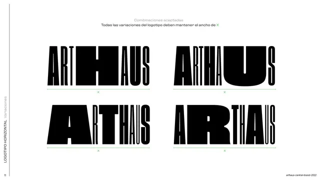
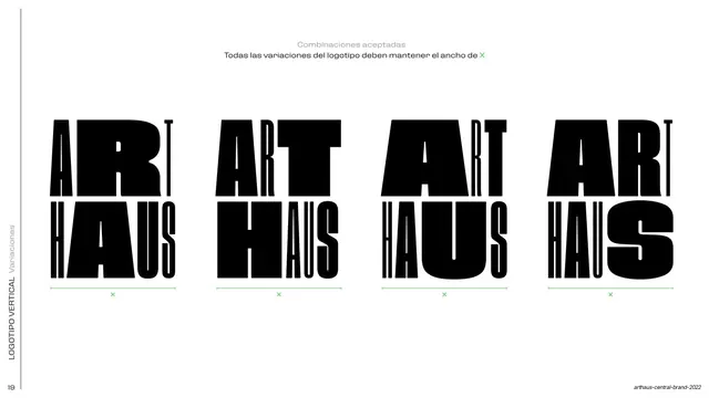
A 2x2 grid of four accepted ARTHAUS lockup variations, each underlined by a green measure bar marked X to show they all hold the same width.
Summary
An accepted-variations page: four different ARTHAUS lockup arrangements in a 2x2 grid, each sitting on a green measure bar labeled X to prove they all keep one constant width.
Visual description
White background. Two small gray header lines state that all logotype variations must maintain width X (with X in green). Below, four black ARTHAUS lockups fill a 2x2 grid, each distorting the relative size and weight of the letters differently (one with an oversized U, one with an enlarged A, and so on) while the square-H anchor persists. A green horizontal measure bar marked with a green "X" runs under each variation, all the same length. A rotated "Variaciones" label and page number "11" sit at the left margin.
Key takeaway
Formalizing a flexible logotype: the letters are allowed to restretch and re-weight per use, and the only invariant is the overall width X, shown by an identical green measure bar under each option. This is the "flexible identity" thesis made into a rule.
Reuse notes
The key page for a deliberately variable wordmark system. Reusable wherever a brand wants sanctioned logo flexibility with one fixed constraint; the green constant-width bar is a tidy device for expressing "vary this, but not that."
From this deck: Horizontal logotype accepted variations
View deck


































More like this









Keep what you find
A free account saves references to boards and can send you a weekly email of picks based on what you save.
To see every result, go Pro.