
Preview image. Unlock full-res
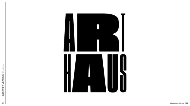
Clear-space diagram for the vertical ARTHAUS lockup, with the stacked black wordmark boxed by cyan margin and padding guides.
Summary
A construction slide showing the minimum clear space around the vertical ARTHAUS lockup, built from cyan margin and padding boxes around the stacked black logotype.
Visual description
White full bleed. A rotated all-caps side label runs up the left edge ("LOGOTIPO VERTICAL / Area de seguridad"). Centered is the vertical lockup: "ART" stacked over "HAUS" in a heavy condensed black display face, where the negative space between the four letters forms an implied square that holds a small teal accent. Two nested cyan rectangles define the safe area: an inner box tight to the mark and an outer margin box, with soft rounded pale-cyan blocks marking the padding increments on each side. A small page number "18" sits bottom-left.
Key takeaway
Showing clear space as two literal stacked boxes plus repeated rounded padding swatches, so the spacing rule reads instantly without dimension callouts. Using the logo's own internal counter-space as the unit of measure.
Reuse notes
A clean template for any brand-guideline clear-space page, especially for a chunky display logotype where the negative space is part of the identity. The cyan-on-white guide treatment keeps construction marks legible without competing with the black mark.
From this deck: ARTHAUS vertical lockup safe area
View deck




































More like this








Keep what you find
A free account saves references to boards and can send you a weekly email of picks based on what you save.
To see every result, go Pro.