Preview image. Unlock full-res
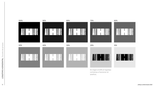
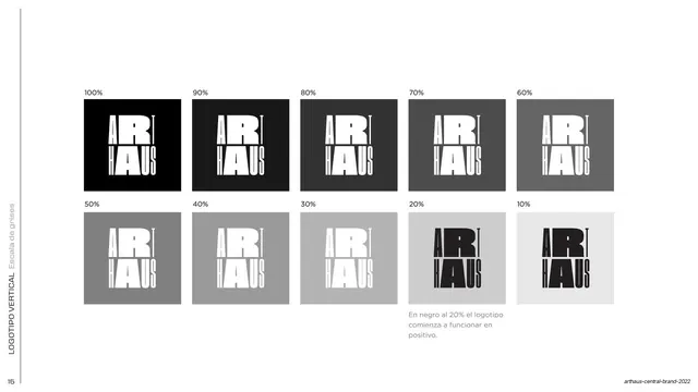
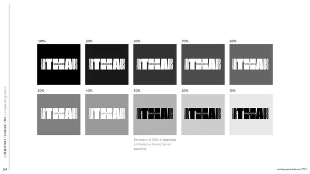
A 10-step grayscale grid from 100% to 10% testing the horizontal logotype's legibility, noting it flips to positive at 20%.
Summary
A grayscale contrast test: the horizontal ARTHAUS logotype shown on ten gray swatches stepping from 100% black to 10%, marking where it must flip from negative to positive.
Visual description
White background. Ten square swatches are arranged in two rows of five, labeled 100% down to 10%. Each swatch holds a small ARTHAUS logotype; in the darker swatches (100%-30%) the mark is white (negative), and at 20% and 10% it switches to black (positive). A small gray Spanish caption under the 20% swatch notes that at 20% black the logo begins to work in positive. Page number "7" and a rotated label sit in the left margin.
Key takeaway
Stating the exact tint threshold where a mark must invert, and proving it visually across an even ten-step ramp rather than describing it in words. The two-row grid makes the tipping point obvious at a glance.
Reuse notes
A reusable contrast-and-legibility spec page for any logo guideline. The ten-step ramp with an explicit flip threshold is directly transferable to other marks and to type or icon contrast rules.
From this deck: Horizontal logotype grayscale scale
View deck


































More like this







Keep what you find
A free account saves references to boards and can send you a weekly email of picks based on what you save.
To see every result, go Pro.