Preview image. Unlock full-res
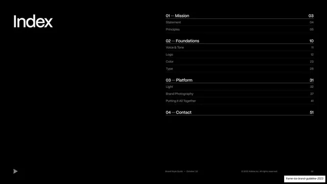
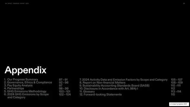
Dark-blue table-of-contents divider listing the full toolbox chapters, with "Area of expertise" called out in white and its subsections indexed at top.
Summary
A recurring chapter-divider page: the full "Our toolbox" contents list on a dark teal-blue ground, with the current chapter "Area of expertise" picked out in bright white while the rest sit dimmed.
Visual description
Deep teal-blue (#0E4E73) full bleed. Top-left a small "Bravida / Brand guidelines" label; a sub-index of the active chapter ("Introduction 52, Sizing options 52, Color options 54, Placement 55") sits in a centered column near the top, and the green sparkle is top-right. The main block is a tall left-aligned list, "Our toolbox" labeling a two-column run of chapter names with page numbers: Logotype 5, Symbol 10, Colors 14, Typography 19, Photography 25, Graphic format 33, Illustrations & charts 36, Icons 42, Tagline 47, Area of expertise 51, Sustainability 57, Overview 60, Applications 61. Every line is dimmed near-navy except "Area of expertise 51", which is full white. "2021" sits bottom-left.
Key takeaway
Reusing one master contents list as every section divider and simply switching the active line to white. It gives the reader a constant map and a clear "you are here" with zero extra layout work.
Reuse notes
Excellent pattern for long guideline or report decks that need repeated wayfinding. Works because the dimmed list stays legible on dark; the top sub-index doubles as a preview of the chapter's own pages.
From this deck: Toolbox contents, Area of expertise highlighted
View deck