Preview image. Unlock full-res
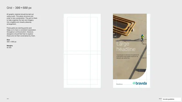
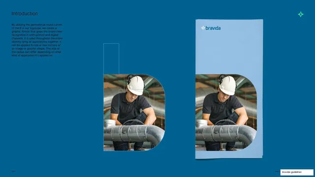
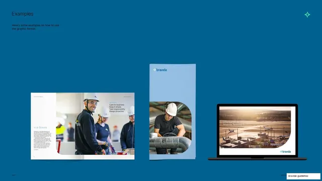
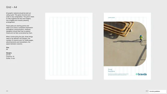
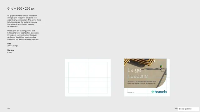
Grid specification for the 300x600 px web banner, with an empty wireframe and a filled photo-banner example side by side.
Summary
The grid-rules page for the tall 300x600 px web banner: an empty column-and-row wireframe next to one finished vertical photo banner.
Visual description
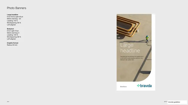
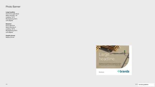
Light grey full bleed. Top-left holds a "Grid - 300x600 px" heading, the same two-paragraph grid rationale used across the deck, and a spec block ("Size: 300 x 600 px", "Margins: 10 mm"). The right side carries two tall white portrait cards. The first is an empty wireframe drawn in pale teal hairlines, showing a two-column, multi-row grid. The second is a finished vertical banner: a top-down photo of looping copper pipes and a small worker filling the upper portion, with white "Large headline" type, a short body paragraph, and a "Bravida.se" url plus the Bravida logo on a white strip at the foot; a concave rounded corner is cut into the image. "2021" sits bottom-left.
Key takeaway
Reusing the identical grid-explanation copy across every format page so only the size and margin numbers change, keeping a long spec section consistent and fast to scan. The tall wireframe-plus-example pairing reads instantly.
Reuse notes
A solid template for documenting any fixed-pixel banner format. The repeat-the-rationale, swap-the-numbers approach is directly transferable. The pipe photography and rounded corner are Bravida-specific assets.
From this deck: 300x600 banner grid spec
View deck


More like this


Keep what you find
A free account saves references to boards and can send you a weekly email of picks based on what you save.
To see every result, go Pro.